Conversion Rate Optimization for Ecommerce A Modern Growth Playbook
Effective conversion rate optimisation is all about turning more of the traffic you already have into paying customers. It's a systematic way of improving your website's user journey to boost the percentage of visitors who buy something.
Done right, it means more sales and more revenue, without having to pour more money into advertising.
Auditing Your Ecommerce Conversion Health
Before you can start fixing the leaks in your sales funnel, you first need a clear map of where they are. This initial audit is the most important part of any CRO strategy because it replaces guesswork with a targeted plan.
It's about understanding how your store is really performing, not just how you think it is.
The first thing to do is get a sense of what a "good" conversion rate even looks like. This is always a moving target, but knowing the current trends gives you a vital benchmark. In the UK, for instance, the digital market is pretty mature. Recent data showed the average ecommerce conversion rate was around 3.1% in late 2024, before settling closer to 2.2% by mid-2025. That's actually quite strong compared to many other regions.
UK Ecommerce Conversion Rate Benchmarks By Industry (2026)
To give you a clearer picture, here's a look at how average conversion rates can differ across some key UK ecommerce sectors. Use this table to get a feel for where your own store might sit within your industry.
Note: These figures are illustrative benchmarks and can vary based on seasonality, specific niche, and market conditions.
Seeing these numbers helps you set realistic goals. If you're selling electronics, aiming for a 4% conversion rate overnight is probably not the right first step. Context is everything.
Finding Your True Conversion Story
With those benchmarks in mind, it's time to dive into your own data. Your goal isn't just to find a single, overall conversion rate. It's to uncover the stories hidden inside the numbers.
Google Analytics (GA4) is where you'll start. It can feel overwhelming, but you don't need to look at everything. Just focus on a few key segments to get started.
These segments are like a magnifying glass, showing you exactly where you need to focus your attention. Begin by comparing:
- Device Performance (Mobile vs. Desktop): It’s incredibly common for mobile to drive most of your traffic, but for its conversion rate to lag way behind desktop. If you spot a big gap here, it’s a massive red flag. It almost always points to a clunky or frustrating mobile experience, especially during checkout.
- Traffic Source Performance: Are visitors from your paid Instagram campaigns converting as well as people from organic search? Analysing performance by channel shows you which marketing efforts are actually delivering a return and which are just driving low-quality traffic that never converts.
- New vs. Returning Visitors: In theory, people who have shopped with you before should convert at a much higher rate. They already know and trust your brand. If they aren’t, it could be a sign of problems with brand trust, product satisfaction, or a poor post-purchase experience.
By segmenting your data, you stop looking at a vague problem like "our conversion rate is low." Instead, you get a specific, actionable insight like, "our conversion rate on iPhones for traffic from Facebook ads is 70% lower than the site average." Now that's a problem you can actually solve.
Pinpointing Your Biggest Opportunities
This initial data dive gives you the evidence you need to act. If your mobile checkout is bleeding sales, that’s your top priority. If one particular marketing channel consistently fails to bring in customers who actually buy, you know it's time to rethink that ad spend. A practical guide can be invaluable as you continuously work to improve ecommerce conversion rates.
This audit isn't about finding every single flaw on your site. It’s about applying the 80/20 rule—finding the 20% of issues that are causing 80% of the drop-offs.
By focusing your efforts on these high-impact areas, you make sure every change is aimed at solving a real, data-backed problem. This is what separates successful CRO from just randomly changing button colours and hoping for the best.
Conducting Your Full Funnel Conversion Audit
Alright, you’ve got your core metrics. Now it’s time to get your hands dirty and really see your store through your customers' eyes. This is where we stop looking at the what (the numbers) and start digging into the why (the human behaviour behind them).
A proper funnel audit isn’t just about finding broken links. It’s a full-on practical review of the entire journey, from the moment someone lands on your site to the second they hit that final "thank you" page. The goal? To uncover the real friction points that are frustrating your users and costing you sales.
This isn’t as complicated as it sounds. It boils down to a pretty simple process.
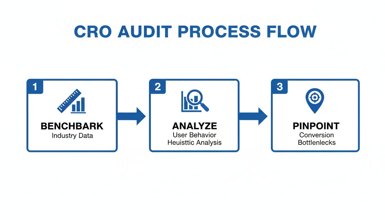
First, you figure out what "good" looks like by benchmarking your numbers. Then you dive into user behaviour to understand what’s actually happening. Finally, you use that insight to pinpoint the exact bottlenecks you need to fix.
Watching Real Users Interact With Your Site
Google Analytics tells you where people are dropping off. That's useful, but it's only half the story. Tools like Hotjar or Microsoft Clarity show you why they're leaving. They let you watch anonymised recordings of real people using your website.
Honestly, this is one of the most eye-opening things you can do. You can literally see someone hesitate on a product page, rage-click a button that doesn’t work, or get stuck in a loop trying to find your shipping policy. Watching even five or ten of these sessions will give you more actionable insights than hours staring at a spreadsheet.
Keep an eye out for these patterns:
- Hesitation: Where do people stop and hover? This often signals confusion. Maybe your pricing is unclear, or a form field is asking for something they don't expect.
- Rage Clicks: Someone frantically clicking on an image or a piece of text that isn't clickable is a massive red flag. It’s a clear sign of a broken expectation or a design flaw.
- Drop-offs: Pay close attention to what a user does right before they leave. Did they get to the shipping page and immediately bounce? That's a strong clue.
These observations are pure gold. They turn an abstract metric like "high cart abandonment" into a tangible, solvable problem: "People are leaving because the discount code box is confusing, and they think their code is broken."
Performing a Heuristic Analysis
While you're watching user sessions, you should also run a heuristic analysis. It sounds technical, but it’s just a common-sense walkthrough of your own site against a checklist of well-known usability principles. Think of yourself as a detective, methodically inspecting the crime scene for clues.
You don’t need to check every single page. Focus your energy where it matters most.
Key Pages for Your Audit
- Homepage & Category Pages: Is your value proposition crystal clear? Can someone find the product they want in a few clicks? Is the search bar obvious and easy to use?
- Product Detail Pages (PDPs): Are your product photos high-quality and informative? Is the 'Add to Cart' button big, bold, and impossible to miss? Are trust signals like reviews, guarantees, and security badges clearly visible?
- Checkout Funnel: Do you offer guest checkout? Are you asking for information you don't really need? And most importantly, are you surprising people with high shipping fees at the very last step? A study found that unexpected costs are the #1 reason for cart abandonment, responsible for a staggering 48% of lost sales.
The point of this audit is to build a backlog of potential issues to test. Don't try to fix everything at once. Your goal is simply to create a list of problems backed by real user data, each with a hypothesis for how to solve it.
By the end of this process, you'll have moved from guesswork to a data-driven plan. You’ll have a prioritised list of test ideas based on genuine user friction, which is the foundation of any successful A/B testing programme.
Turning Product Pages Into Persuasion Engines
Your product pages are the digital shop floor. It’s the final, critical moment where a curious browser decides whether to become a paying customer. It's time to stop thinking of these pages as simple product listings and start treating them as powerful assets that actively persuade and convert.
We’re not just talking about good pictures. The real magic happens when you pair great visuals with persuasive product descriptions that tell a story, solve a problem, and connect with your customer on a deeper level.
Crafting Compelling Product Narratives
Your product description is your 24/7 salesperson. It needs to do more than just list features; it has to sell the benefits. Instead of saying a backpack has "water-resistant nylon," explain that it "keeps your laptop safe and dry during unexpected downpours."
See the difference? This subtle shift helps a shopper visualise themselves using and loving your product. A great description doesn't just inform—it creates desire.
Expert Tip: Think of your product description as a conversation. Anticipate your customer's questions and answer them directly in your copy. Is the material ethically sourced? Is it machine washable? Answering these questions upfront builds confidence and removes friction.
Understanding how you stack up is also crucial. Recent analysis of UK e-commerce shows just how much conversion rates can vary by industry. Arts and Crafts, for instance, led the pack with a 3.89% conversion rate in early 2025, while Food & Drink saw a massive 35.57% surge in performance to just over 1%. For Shopify merchants—where UK stores often outperform their European counterparts—these industry-specific trends highlight where the biggest opportunities for optimisation lie.
Building Instant Trust with Social Proof
In e-commerce, trust is currency. And one of the fastest ways to build it is by showing that other people already love your products. Social proof is a powerful psychological trigger that makes new customers feel confident in their decision to buy from you.
But effective social proof isn't just about plastering five-star ratings everywhere. It's about authenticity.
- Authentic Reviews: Don't just ask for a rating. Encourage customers to leave detailed reviews by prompting them with questions about fit, quality, or how they used the product.
- User-Generated Content (UGC): Showcase photos and videos of real customers using your products in their own lives. A gallery of happy customers on your product page is more persuasive than any polished ad campaign could ever be.

The sketch above brings these elements together. It’s not just a product; it’s a story told through customer ratings, real-world testimonials, and a clear call to action. This is what a persuasion engine looks like.
Eliminating Friction with Instant Answers
Unanswered questions are conversion killers. A shopper who is uncertain about sizing, materials, shipping times, or your return policy is far more likely to abandon their purchase than to hunt for an answer. This is one of the biggest, yet most solvable, friction points on any product page.
This is precisely where a modern AI sales assistant like Marvyn changes the game. Think of it as having your best sales associate on every single product page, 24/7. It provides immediate, accurate answers to common questions, guiding uncertain shoppers with the same expertise as a human. This proactive engagement often starts with a simple greeting, setting a friendly, helpful tone. You can learn more about how to create an effective welcome message for your website in our dedicated guide.
Imagine a customer is looking at a dress and wonders, "Is this true to size?" Instead of leaving to search for a size guide, they can ask the AI directly and get an instant, contextual answer. This seamless experience not only answers their question but also keeps them engaged and moving confidently toward the 'Add to Cart' button.
By automating this pre-sales support, you free up your team while ensuring every shopper gets the help they need, exactly when they need it.
Designing A Frictionless Checkout Experience
The checkout is the final hurdle. It’s the make-or-break moment where all your marketing and merchandising efforts either pay off or fall apart. This is your playbook for plugging the leaks and removing every single obstacle standing between a curious browser and a happy customer.

Our mission is simple: make buying so easy your customers barely have to think about it. Every click, form field, and second of load time matters here more than anywhere else on your site.
Eliminate Unnecessary Hurdles
The single biggest mistake you can make at checkout is forcing first-time buyers to create an account. For someone new to your brand, it's a huge commitment and a major point of friction. Always, always offer a prominent guest checkout option.
From there, get ruthless about simplifying your forms. Every field is another chance for someone to give up and leave.
- Only ask for what you absolutely need. Do you really need their phone number or company name to ship the product? If not, cut the field.
- Use smart defaults and auto-complete. Automatically populate the billing address from the shipping details. Tools like Google Address Autofill are your best friend here.
- Show progress clearly. If you have a multi-step checkout, a visual progress bar is essential. It tells customers exactly where they are in the process, reducing anxiety and keeping them moving forward.
Remember, the checkout isn't the place to gather marketing data; it's the place to close the sale. Keep it lean, fast, and focused on the single goal of completing the transaction.
Another classic conversion killer? Surprising customers with high shipping costs on the final page. Unexpected costs are the number one reason people abandon their carts. Be upfront. Display shipping fees or a shipping calculator as early as you possibly can—ideally on the product page or in the cart itself.
The Single-Page vs Multi-Step Debate
There's no single "right" answer here. The best checkout flow—single-page or multi-step—depends entirely on your audience and your products.
- Single-Page Checkout: Puts all the form fields on one screen. This can feel faster for simple purchases but often looks overwhelming and cluttered if you need to collect a lot of information.
- Multi-Step Checkout: Breaks the process into logical chunks (e.g., Shipping, Billing, Payment). This feels more organised and less intimidating, guiding the user through one small task at a time.
For most stores, a well-designed multi-step checkout tends to perform better, especially on mobile, because it breaks a large task into manageable bites. But the only way to know for sure is to test what works for your specific audience.
A Mobile-First Checkout Is Non-Negotiable
Mobile commerce now defines the UK market. With smartphones powering 70% of transactions—generating over £100 billion in sales—a clunky mobile checkout isn't just an annoyance; it's a direct threat to your revenue.
Yet, mobile conversion rates still lag behind desktop. Why? Persistent UX hurdles. For DTC brands, pre-sales questions alone can drive up to 40% of abandonments. This is where automation comes in. UK pilots have shown that using AI chatbots for consultative selling can boost conversions by 20-30%.
Your checkout must be designed for thumbs, not a mouse pointer. This means:
- Large, tappable buttons that are easy to hit without zooming.
- Numeric keypads that automatically appear for phone number and credit card fields.
- Simplified forms that require the absolute minimum amount of typing.
Offering accelerated payment options is also a game-changer for mobile conversion. Digital wallets like Apple Pay and Google Pay let customers check out with a single tap using biometrics. It's the ultimate frictionless experience.
This is also where on-demand support can save a sale. If a customer has a last-minute question about shipping or a discount code isn't working, they need an answer immediately. Waiting for an email response means they're gone.
Having an automated tool, like an AI-powered chat agent, provides that instant support. It resolves issues that would otherwise lead to an abandoned cart, right when it matters most. You can learn more about how to strategically deploy live chat on a website to capture these sales.
The difference between relying on a manual team versus an autonomous AI chatbot is stark, especially when it comes to cost, speed, and scale.
Manual Support vs Automated AI Chatbot
An AI chatbot doesn't just answer questions; it provides a scalable, cost-effective safety net that ensures no customer is left waiting at the most critical point of their journey.
Building A Data-Driven A/B Testing Program
Effective conversion rate optimisation for ecommerce is a science, not a guessing game. It’s time to stop making random tweaks and just hoping for the best. A structured A/B testing programme is what separates the stores that stagnate from those that see consistent, predictable growth.
This is where you take all those valuable insights you gathered during your audit and turn them into real, measurable improvements. It's about building a repeatable process that ensures every change you make is a proven win, backed by data from your actual customers.
Prioritising Your Test Ideas
After a thorough audit, you’ve probably got a long list of potential fixes and shiny new ideas. The temptation is to jump on whatever seems easiest, but that’s almost never the most effective way to go. You need a simple framework to figure out what to test first.
One of the most popular methods is the PIE framework: Potential, Importance, and Ease.
- Potential: How much room for improvement is there on the page? A product page with a sky-high bounce rate has a lot more potential than one that’s already performing well.
- Importance: How valuable is the traffic to this page? Your main checkout page is obviously far more important than a rarely-visited blog post from three years ago. Focus on your high-traffic, high-value pages.
- Ease: How quickly and easily can you actually implement the test? Changing a headline is simple. A complete redesign of your checkout process is not.
Score each test idea from 1 to 10 for each of the three categories. Add them up, and start with the ideas that have the highest total score. This simple system makes sure you’re always putting your resources where they’ll have the biggest impact on your bottom line.
Forming A Strong Hypothesis
Every single A/B test needs a clear, testable hypothesis. This isn't just a vague guess; it's a structured statement that frames your entire experiment and defines what success actually looks like.
A solid hypothesis should always follow this format:
"By making [this change], we believe it will cause [this outcome], because [this reason]."
Let’s use a real-world example. Say your audit showed a lot of people drop off right after adding an item to their cart. You suspect the mini-cart pop-up is too subtle, leaving shoppers confused about the next step.
A weak hypothesis: "We will test a new cart button."
A strong hypothesis: "By changing the mini-cart behaviour to automatically open a side-cart drawer, we believe it will increase the 'reach checkout' rate because it makes the next step clearer and reduces friction for the user."
This structure forces you to be specific about what you’re changing, which metric you expect to move, and why you think it will work. That clarity is absolutely crucial when it's time to analyse the results.
Running And Analysing Your Tests
Once you have your hypothesis, it’s time to set up the experiment in a tool like Google Optimize (which is being integrated into GA4), VWO, or your platform’s built-in testing feature. Now comes the hard part: patience.
One of the most common and fatal mistakes is peeking at the results too early. It’s tempting, I know, but ending a test after just a couple of days because one version looks like it's "winning" can easily give you a false positive. You need to run the test long enough to reach statistical significance—that means a confidence level of 95% or higher. This is what confirms your results are due to the change you made, not just random chance.
You should also let tests run for at least one full business cycle (usually one to two weeks) to smooth out any daily ups and downs in customer behaviour. Once you have a statistically significant winner, you can confidently roll the change out to 100% of your visitors.
And remember, every test—win or lose—gives you valuable insight. A losing test isn't a failure; it’s a lesson that just stopped you from rolling out a change that would have hurt your conversion rate. This disciplined approach is what transforms CRO from a series of gambles into a sustainable engine for growth. The insights you gain from testing can even inform how you deploy other tools, such as the conversational strategies used by AI sales agents to guide customers.
Your Questions On Ecommerce CRO Answered
Diving into conversion optimisation can feel like learning a new language, with unfamiliar terms and strategies at every turn. Let's cut through the noise and tackle some of the most common questions ecommerce owners ask. These are the practical, straight-to-the-point answers you need to start making progress with confidence.
How Long Does It Take To See CRO Results?
This is the million-dollar question, and the honest answer is: it depends. The timeline for seeing results from your conversion rate optimisation for ecommerce efforts comes down to two things: what you're changing and how much traffic your site gets.
For instance, a simple A/B test on a button's colour might give you a statistically significant winner in just two to four weeks, assuming you have the visitor numbers to get clean data. Bigger changes, like adding a guest checkout or totally simplifying your main navigation, can often show a positive lift in your metrics almost overnight.
But here’s the thing: you have to see CRO as a long-term game, not a one-and-done project. The real, lasting value comes from consistent, iterative testing. Small wins compound over months, leading to massive—and more importantly, sustainable—growth for your business.
What Are The Most Important CRO Metrics To Track?
Beyond just your overall conversion rate, you need a focused dashboard of key metrics to really see what’s going on. Staring at a mountain of data is just as unhelpful as having none at all.
Zero in on these three core metrics:
- Cart Abandonment Rate: This is a direct pulse check on your checkout. If this number is high or creeping up, it’s a massive red flag pointing to friction, like surprise shipping costs or a clunky form.
- Average Order Value (AOV): This metric makes sure your optimisation efforts are actually growing revenue, not just the number of conversions. For example, a new discount code might spike sales but tank your AOV, leaving you with less profit overall.
- Revenue Per Visitor (RPV): This is a brilliant, all-in-one metric. It blends your conversion rate and AOV to give you a single, powerful number that shows you the true financial health of your site.
When you bring in a new tool, make sure you track its direct impact, too. If you’re using an AI chatbot like Marvyn AI, for example, you’d want to keep a close eye on specific goals like "conversations leading to purchase" and "abandoned cart recovery rate" to measure its direct ROI.
Can I Do CRO Myself Or Do I Need An Agency?
You can absolutely get started with CRO on your own. In fact, it's often the best way to begin. So many of the most effective tools—from Google Analytics and Hotjar to modern AI chatbots—are designed for business owners, not just technical specialists.
A great place to start is by tackling the "low-hanging fruit" you probably spotted during your site audit. These are the simple fixes that have a high chance of making a real impact, like:
- Rewriting your product descriptions to be more compelling.
- Adding more trust signals like customer reviews and security badges.
- Cutting unnecessary fields from your checkout forms.
As your store scales and your testing gets more sophisticated, you might decide to bring in a specialist or an agency. But getting that foundational work done in-house is priceless. It builds a culture of continuous improvement that will pay dividends for years. For some great, actionable strategies you can implement right away, check out these 10 proven ecommerce conversion rate optimization tips.
What Is The Difference Between SEO and CRO?
It’s easy to get these two mixed up, but they have very different jobs that work together like a tag team.
Think of it like throwing a party. SEO (Search Engine Optimisation) is all about getting more of the right people to your door. Its job is to boost qualified traffic from search engines like Google by making your site more visible.
CRO (Conversion Rate Optimisation), on the other hand, is about making sure the people who are already at the party have a great experience and do what you want them to do (like buy something). Its job is to improve the on-site experience and persuade your existing visitors to take action.
They are two sides of the same growth coin. SEO brings you the visitors; CRO turns those visitors into customers.
Ready to turn more browsers into buyers and automate your customer support? Marvyn AI is a fully autonomous Shopify chatbot that answers over 70% of support questions and guides shoppers to checkout, just like a top sales rep. Get started for free and go live in minutes. Install Marvyn AI today.