7 Shopify Store Example Breakdowns for 2026
What separates a good Shopify store from a great one?
Most roundups get this wrong. They treat a shopify store example like a mood board. Nice homepage, clean fonts, strong photography, done. That’s not how stores win. Stores win when the design helps a shopper make a decision faster, with less doubt and fewer dead ends.
That matters even more on Shopify because the platform is no longer a niche choice. Shopify holds a 10.32% global platform share, with substantial UK presence and over $1 trillion in cumulative sales processed by 2024. In practice, that means your customer has seen polished Shopify experiences before. They already know what a fast cart feels like, what clear returns messaging looks like, and how quickly they expect answers on mobile.
A strong store doesn’t just look branded. It handles hesitation. It answers sizing questions before they become support tickets. It makes bundles feel helpful instead of pushy. It uses navigation, merchandising, and pre-sales support to reduce the effort required to buy.
That’s the lens used here.
These seven brands aren’t interesting because they’re famous. They’re useful because each one solves a different ecommerce problem well. Gymshark handles velocity and drop pressure. Huel turns repeat purchase into a managed habit. PANGAIA balances editorial storytelling with product discovery. Castore deals with catalogue complexity. Lounge sells fit and sets visually. Lick reduces decision anxiety in a high-consideration category. Snug sells bulky, configurable products online without making the journey feel impossible.
The point isn’t to copy their aesthetic. The point is to understand the operating logic under the design.
If you need a shopify store example you can learn from, start with what the page is trying to get the shopper to do next, then examine every design choice against that job. That’s where the useful patterns show up.
1. Gymshark
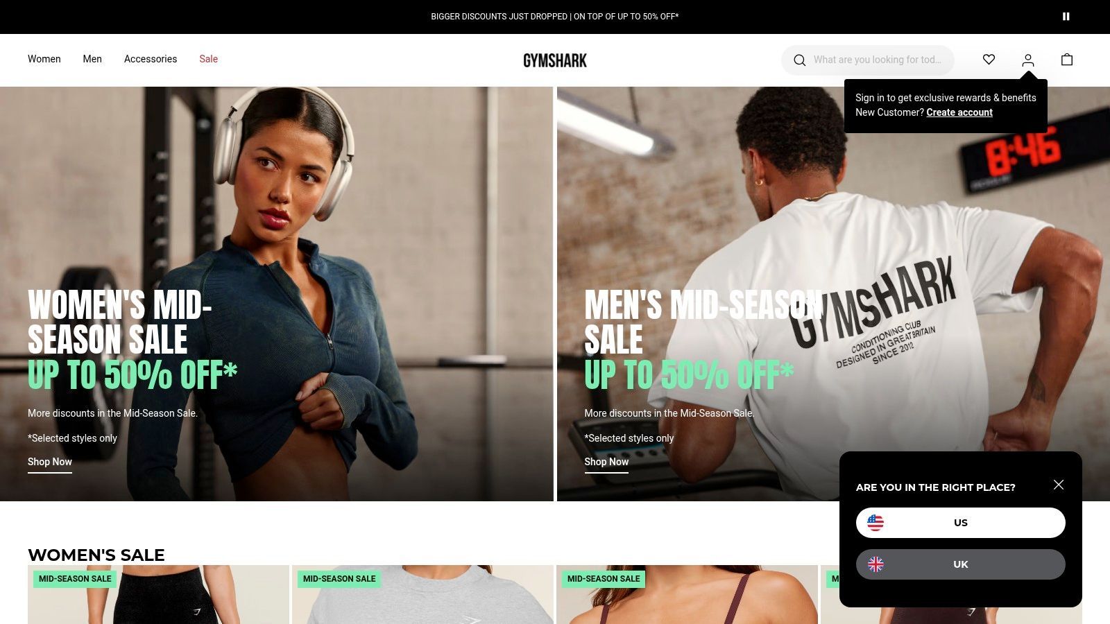
What does a high-pressure Shopify store look like when the customer arrives ready to buy?
Gymshark UK is a strong answer because the storefront is built for compressed decision-making. A lot of traffic does not start with product discovery on-site. It starts with creators, social content, launches, and sale events that create intent before the visit. That changes the job of the store. The site needs to confirm the shopper is in the right place, surface the right collection fast, remove sizing hesitation, and keep checkout moving.
That operating logic shows up across the experience. Collection pages are built to sort demand quickly. Product cards do not try to be editorial. Product pages keep the buying questions close to the point of action, especially fit, colour, size availability, and delivery expectations. For an apparel brand with drop energy, that matters more than adding design flourishes that slow scanning.
The conversion pattern behind the speed
Gymshark’s best move is not visual polish. It is decision support placed where hesitation usually happens.
On apparel stores, conversion often breaks at the same points: fit uncertainty, stock ambiguity, weak imagery, and unclear delivery or returns terms. Gymshark handles those pressure points early. The shopper can usually assess the product fast, understand the fit context, and move toward size selection without hunting through the page. That reduces the small delays that turn high intent into abandoned sessions.
This is also why the store works as a teardown example, not just a source of inspiration. The lesson is not "use bold creative". The lesson is to structure the page around the next commitment. On a Gymshark product page, that commitment is usually size selection, then add to cart. Brands trying to improve conversion should audit every block against that path and cut anything that slows it. If your store has similar friction points, these practical ways to reduce cart abandonment on Shopify are a better model than copying visual style alone.
Practical rule: If you run launches, sales, or influencer-led traffic spikes, put fit guidance, stock visibility, delivery timing, and returns reassurance near the add-to-cart area.
Trade-offs worth copying carefully
Gymshark benefits from urgency, but urgency has a cost. Fast-selling sizes and colourways can raise demand, yet they also increase the chance that a ready buyer leaves empty-handed. Stores often copy the countdown energy and forget the recovery system. Back-in-stock capture, clear variant states, and sensible alternatives matter more than the hype device itself.
Merchandising discipline matters too. If a launch pushes large volumes of shoppers into collection pages, the order of products, colours, and available sizes has a direct revenue effect. Hero products need to appear early. In-stock options need to stay visible. Bestsellers should not get buried under newness if the immediate goal is sell-through.
Gymshark also handles localisation better than many fashion brands. Delivery and returns information usually feels specific to the market instead of generic platform copy. That lowers the number of shoppers who pause the purchase to verify basic policy details elsewhere.
The replicable takeaway is clear. Build for speed, but only after you identify where your customer hesitates. Gymshark’s store works because it removes the friction points that matter for apparel bought under time pressure.
2. Huel
Huel UK answers a tough retail question. How do you sell a habit, not just a food product?
That changes the job of the store. Huel has to convert a first-time visitor who wants reassurance on taste, ingredients, and use cases, while also giving repeat buyers a fast path back to the same products. Many nutrition brands handle one side well and fail on the other. Huel gets closer to the right balance because the whole store is built around repeatability.
Why Huel’s structure converts
The core strategy is subscription-led merchandising. Huel does not bury repeat purchase options in the cart or post-purchase flow. Cadence, savings, bundles, and routine-based product grouping appear early, so the customer understands the model before checkout. That matters because subscription works best when it feels like a sensible buying format, not a discount trap.
The product pages carry more copy than a typical FMCG brand, but the density is doing a job. Meal replacement and daily nutrition products create more friction than a standard snack purchase. Shoppers want to know what the product replaces, how often to use it, what it contains, and whether it fits their goals. Huel keeps those answers close to the buying decision instead of pushing them into a buried FAQ.
Shopify is also a practical fit for this model. Shopify reported strong revenue growth in Q2 2024, which reflects how much the platform has improved for brands that need subscriptions, bundles, localisation, and high-volume merchandising in one storefront. Huel benefits from that maturity, especially when traffic comes from repeatable paid social and creator channels. Brands building a similar acquisition loop should study how selling on Instagram connects to a replenishment-focused landing experience, because click quality drops fast when the page does not match the promise of the ad.
Dense PDPs work when each module removes a real objection. If a block does not help the shopper choose, trust the product, or commit to a routine, it should not be there.
Trade-offs worth copying carefully
What works:
- Subscription visibility: The recurring option is prominent without making one-time purchase feel hidden or awkward.
- Bundle design: Huel groups products around behaviour and outcomes, which is stronger than generic cross-sells.
- Routine framing: The site sells scenarios such as breakfast replacement, convenience, or daily nutrition support, which matches how people shop this category.
- Regional clarity: UK shoppers get market-specific routing and checkout context, which protects conversion.
What needs care:
- Content load: New visitors can get overwhelmed if they want a quick answer and hit too much explanation at once.
- Choice friction: A broad range helps retention, but it can slow the first order if product differences are not obvious enough.
- Recommendation fragility: If stock shifts by region or flavour availability changes, guided buying paths can break.
Huel is a strong shopify store example because it shows the commercial logic behind retention-focused design. The lesson is not “add subscriptions.” The lesson is to reduce effort across the first and second purchase. If your store gets product interest but loses people before checkout, focus on reducing cart abandonment with clearer commitment options, lower-risk bundles, and a reorder path that feels immediate.
3. PANGAIA
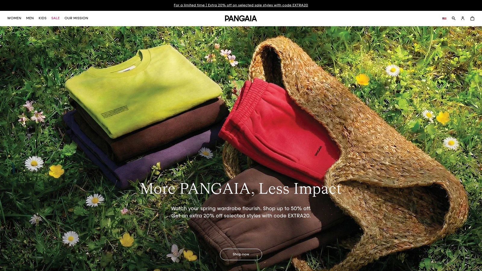
What happens when a fashion brand tries to sell fabric science, sustainability claims, and limited drops on the same product page without killing conversion? Usually, the store gets slow, over-explained, or hard to shop. PANGAIA handles that balance better than most.
The reason is structural, not just aesthetic. PANGAIA does not treat brand story as a separate content layer that shoppers have to go hunting for. It places the commercial argument close to the buying decision. Material innovation, care instructions, colour context, and collaboration framing sit near the product instead of being buried in editorial pages that only a small slice of visitors will read.
That matters because the product itself often looks familiar. A sweatshirt, tracksuit, or tee can appear interchangeable at first glance. PANGAIA has to explain why its version deserves a premium, and it does that by reducing doubt at the point of intent. The product page carries more of the selling load than the homepage.
Where the store earns conversion
The strongest move is how PANGAIA translates abstract brand claims into buying reassurance. Material details are presented as decision support, not just brand theatre. Care guidance helps justify the price and reduces post-purchase disappointment. Collaboration and limited-run context create urgency, but the store still keeps the path to size, colour, and checkout obvious.
That is the trade-off many founder-led fashion brands get wrong. They invest in story, then force product discovery to compete with it. PANGAIA shows a better model. Story should clarify the reason to buy this item now, not ask the shopper to study the brand before earning permission to browse.
There is also a useful retention lesson here. Brands built on social discovery often attract visitors who are curious but not fully convinced. In that situation, guided product education and timely prompts matter more than broad inspiration. Tools used for AI chat support in fashion e-commerce can help answer fit, fabric, and product-difference questions without sending shoppers off the page.
Trade-offs worth copying carefully
PANGAIA benefits from having a clear brand thesis. That gives the merchandising team stronger raw material to work with. But the model is less forgiving than it looks.
If collection pages are weak, storytelling starts to slow down shoppers who arrived ready to buy. If search is poor, the premium narrative turns into friction. If sustainability and innovation claims are vague, they stop helping conversion and start sounding decorative.
PANGAIA is a good reminder that brand depth should shorten the path to confidence, not lengthen the path to product.
That is why this store works as a strong shopify store example. The lesson is not to add more editorial design or denser copy. The lesson is to connect brand meaning directly to the commercial moment. If your category relies on feel, quality, provenance, or mission, explain those points where shoppers choose, compare, and hesitate. That is the part competitors struggle to copy.
4. Castore
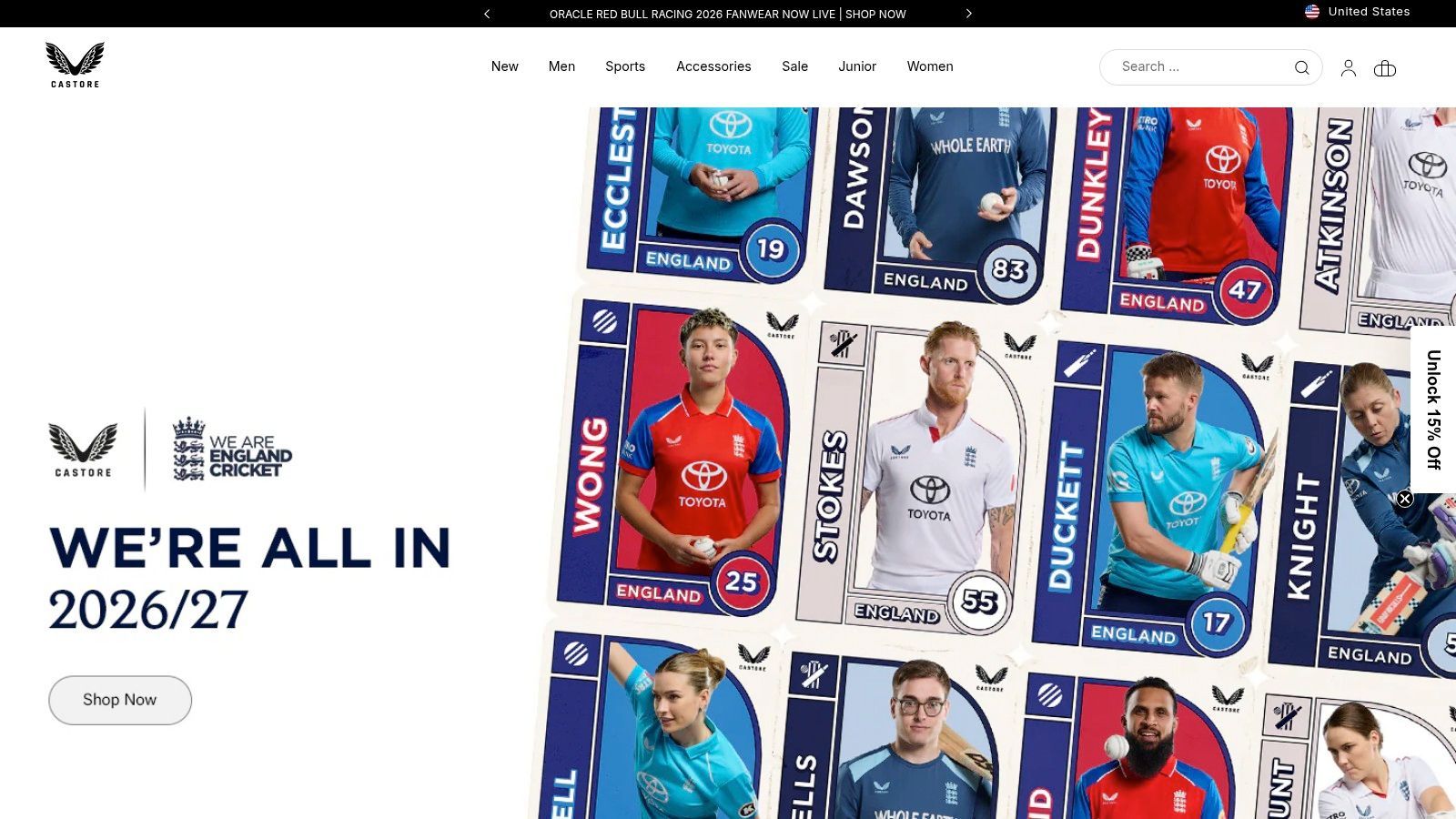
What does a store look like when the actual challenge is not brand storytelling, but SKU control at scale? Castore is a strong example. It has to sell teamwear, fan merchandise, seasonal capsules, athlete collaborations, and performance product inside one storefront without collapsing into a messy catalogue.
That makes this less a style reference and more a strategic teardown of merchandising architecture.
Castore’s best decision is audience-based routing. Club supporters, performance shoppers, and campaign traffic do not all want the same path, so the store gives them different entry points and different collection logic. That sounds simple, but plenty of multi-category brands still force every visitor through one broad catalogue and then wonder why discovery underperforms.
Why the structure works
In sportswear, high SKU turnover creates a practical problem. New drops, club launches, and restocks can bury each other fast if the taxonomy is weak. Castore avoids some of that by giving teams, collections, and campaigns clear ownership across the store.
The conversion lesson is straightforward. Good structure reduces decision load. Shoppers who arrive for a club kit should reach that inventory fast. Shoppers browsing training gear should not have to filter through fan merch to get there. Castore handles that separation well enough to protect intent without making the store feel completely disconnected.
There is also a platform lesson here. Brands with regional merchandising, launch calendars, and wide product depth need a backend that the team can work with day to day. The value is not abstract scale. It is the ability to update collections, route traffic, and keep launch operations under control without turning every change into a development task.
A lot of teams miss that trade-off. They focus on homepage polish and ignore catalogue governance.
Where this model can lose revenue
Segmentation helps conversion until it starts hiding the rest of the business. That is the risk with stores like Castore. A shopper can enter through a team page, complete that journey, and leave without ever seeing adjacent categories that would have made sense as add-ons. The same problem works in reverse for performance buyers who never touch collaboration or supporter ranges.
That is why shared UX rules matter. Search, filters, naming conventions, and on-page cross-links have to connect these sub-journeys back into one commercial system. Brands working on improving ecommerce customer experience usually get more value from fixing that routing layer than from redesigning the homepage again.
- What to copy: Clear category ownership, dedicated campaign landing pages, and region-aware merchandising.
- What not to copy blindly: Micro-stores that feel like separate businesses with different navigation rules.
- What to fix first if you run a complex catalogue: Search quality, filter logic, and collection naming.
Field note: Multi-audience stores usually do not struggle to attract traffic. They struggle to send each visitor into the right buying path.
Castore works as a shopify store example because it shows how store structure shapes conversion. For brands running frequent launches, club partnerships, or segmented buying journeys, the lesson is clear. Treat taxonomy, routing, and collection logic as revenue decisions, not back-office housekeeping.
5. Lounge
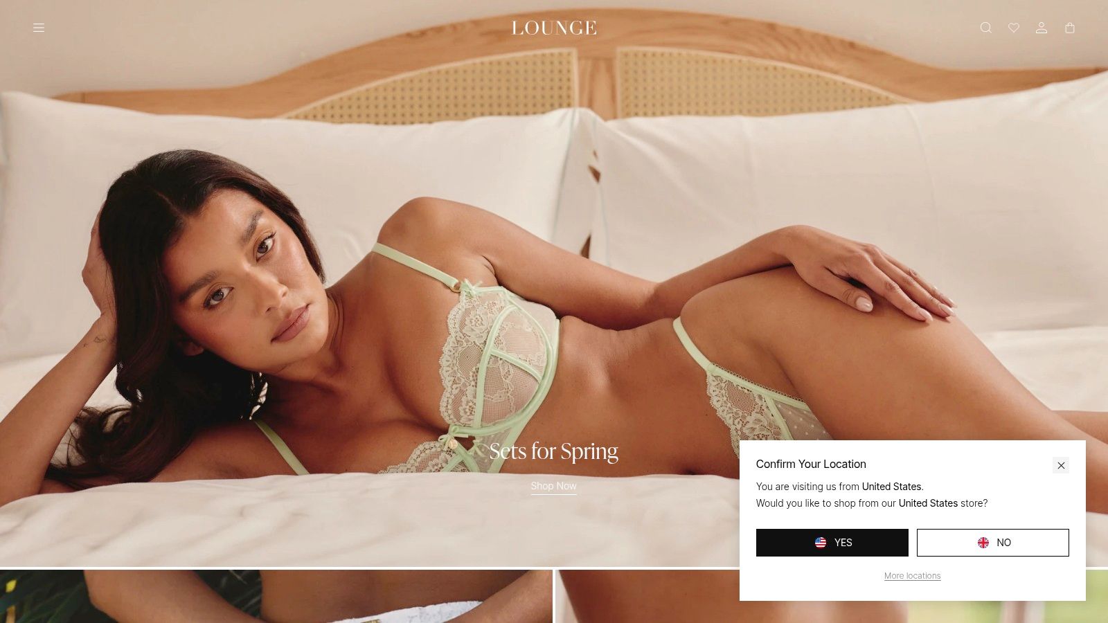
What does a lingerie store have to do before a shopper will buy without trying anything on first?
Lounge answers that question better than many fashion brands. The store sells desire, but it also has to remove doubt around fit, coverage, fabric, and whether a full set will look right on the customer rather than only on a styled model. That makes this a useful Shopify store example because the merchandising job is not just to attract attention. It is to build enough confidence for a category with obvious hesitation built into it.
The store gets that balance mostly right on mobile. Product cards, campaign imagery, and collection layouts are designed for fast scrolling, but they still carry enough visual information to keep the shopper moving. For a brand like this, that matters more than homepage spectacle. The primary conversion work happens inside collection grids and PDPs.
Why the visual system works
Lounge uses product imagery as proof, not decoration. Matching sets are shown together. Close-up fabric shots help set texture expectations. Model photography gives a clearer sense of cut and styling, which reduces one of the biggest gaps in intimate apparel ecommerce. Shoppers are trying to answer private questions quickly. Good imagery shortens that process.
The campaign structure helps too. Frequent drops can fragment a catalogue if every launch feels disconnected from the core range. Lounge avoids a lot of that risk by keeping a consistent visual hierarchy across collections, promotions, and product pages. New arrivals still feel part of one retail system.
That is the strategic lesson.
A lot of brands copy the aesthetics of fashion stores and miss the operating logic underneath. Lounge uses editorial presentation to support merchandising. The visuals help shoppers understand the product, the set relationship, and the broader collection context with very little effort. Brands working on improving ecommerce customer experience should study that sequence closely. Reassurance has to appear before hesitation turns into a bounce.
The trade-offs behind the model
This approach has costs. A heavy launch calendar can push proven evergreen products out of view unless search, category logic, and restock handling are tightly managed. In apparel, that problem hits revenue fast. Bestsellers often carry more margin certainty than new drops, but they are easier to bury.
Fit support is the other pressure point. Strong photography gets a shopper closer to purchase, but it does not fully answer sizing concerns, especially for first-time buyers trying a new cut or buying coordinated sets. That is where many stores in this category leave money on the table. They stop at inspiration when the buyer still needs guidance.
The practical takeaway is simple. Merchandise confidence with the same discipline you use to merchandise style. Show the product clearly, show how pieces work together, and place reassurance close to the point of decision. Lounge works because it understands that conversion in this category depends less on novelty alone and more on reducing the cost of uncertainty.
6. Lick
What does a strong Shopify store look like when the customer is scared of making a visible, expensive mistake?
Lick UK answers that question well. Paint is a high-friction purchase disguised as a simple product. Customers are not just choosing a colour. They are judging light, finish, room type, coverage, and whether the result will annoy them every day for the next few years. That changes the conversion job.
Lick builds the journey around risk reduction. The store gives shoppers smaller commitments first, clearer guidance second, and the full purchase only after confidence starts to build. That sequencing is the strategic point. It is a good example of guided commerce used properly.
Why the architecture matters
Lick’s headless setup supports that model. A brand in this category needs more than standard product pages and collection grids. It needs room guides, sampling journeys, educational modules, and flexible merchandising paths that can change without rebuilding the whole storefront each time the team wants to test a new buying flow.
The trade-off is real. Headless gives more control over content and UX, but it also raises the operating standard. Performance, QA, merchandising logic, and content governance all need tighter management. Brands often copy the architecture before they have the team to run it well. That is usually a mistake.
The better lesson is simpler. Use the stack that lets you reduce hesitation fastest.
What Lick gets right
- Sampling is treated as a conversion tool: Peel-and-stick samples lower the cost of being wrong and create an easy first action for cautious buyers.
- Advice sits inside the buying path: Shoppers do not have to leave the commercial journey to get practical help on colour choice or finish.
- Reassurance feels operational, not decorative: Support options, consultation cues, and store presence all answer the customer’s real concern, which is "Will this work in my home?"
That last point matters more than it looks. Many home brands produce attractive inspiration content, then leave the customer to translate it into a purchase decision alone. Lick closes more of that gap.
There are downsides. Visual selling is important in this category, but heavy imagery can slow pages and hurt the exact confidence the site is trying to build. Rich guidance also creates maintenance pressure. If advice content, stock availability, and sample flows fall out of sync, trust drops quickly.
Don’t copy Lick’s tech stack by default. Copy its decision structure.
Lick is a useful shopify store example because it shows what works in considered categories. If the buyer fears choosing badly, the store should reduce uncertainty before it asks for commitment. That is the core strategy underneath the design.
7. Snug
Snug Sofa sells one of the toughest products in ecommerce. Sofas are high-consideration, physically bulky, expensive to return, and full of practical objections. Will it fit? What does the fabric feel like? How does modularity work? What happens on delivery day? If a store can’t answer those questions fast, conversion stalls.
Snug’s strength is that it treats the website like a guided sales environment, not a digital brochure. That’s the right call for furniture.
Why consultative selling is essential here
A useful benchmark comes from high-ticket ecommerce. One high-ticket dropshipping store generated $100,000 in revenue within 90 days from 93 orders, with a $2,000 average order value. The point isn’t to compare sofas to dropshipping. The point is that when AOV rises, each pre-sales question becomes commercially important. A single resolved objection can be worth far more than in low-ticket retail.
Snug leans into that logic with modular configuration, pre-purchase education, and delivery support built into the journey. Live shopping and virtual showroom concepts also fit the category because they simulate the kind of reassurance shoppers normally seek in person.
For high-ticket categories, support isn’t a cost centre. It’s part of conversion architecture.
The real trade-offs
Furniture stores always carry logistics friction. Lead times can stretch, returns can be painful, and the more configurable the product becomes, the easier it is to overwhelm a first-time visitor. Snug’s challenge isn’t just selling the product. It’s sequencing information so the shopper gets clarity before fatigue.
What works best is the guided path. Visualisation tools, practical buying support, and post-purchase scheduling all reduce uncertainty. What can go wrong is depth overload. If every option appears at once, the shopper delays instead of deciding.
There’s also a broader platform lesson here. Shopify Plus has shown it can support scale-sensitive migrations. Bombay Shaving Company reported a 150% uplift in conversion rate and a 20x increase in online revenue after moving from Magento to Shopify Plus. That case is a different category, but the underlying takeaway applies to stores like Snug. Technical stability matters when you’re selling products that generate longer sessions, more questions, and higher purchase pressure.
Snug is one of the strongest examples in this list because it sells complexity without making the journey feel impossible.
Top 7 Shopify Stores Comparison
From Inspiration to Implementation Your Next Steps
What should you copy from a strong Shopify store example?
Start with the decision system, not the design layer. Each store in this teardown is built around a specific buying task. Gymshark shortens fast, high-intent purchases. Huel supports routine buying and subscription management. PANGAIA uses storytelling to increase product confidence. Castore keeps a complex catalogue usable. Lounge reduces fit anxiety on mobile. Lick helps shoppers choose correctly before they commit. Snug guides customers through a higher-friction purchase with more clarity upfront.
That is the useful lesson here. Strong stores win because they remove uncertainty at the exact point where a shopper would otherwise hesitate.
The pattern shows up across very different categories. These brands answer key pre-purchase questions inside the journey instead of forcing customers to open a support ticket, leave the site, or guess. Fit, delivery timing, returns, product differences, compatibility, replenishment, and setup all get handled before checkout. On mobile, that matters even more because patience is lower and comparison shopping is faster.
For a merchant, the trade-offs to consider are usually operational, not visual. A redesign can improve perception, but it rarely fixes weak product education, poor merchandising logic, or missing decision support on its own. In practice, conversion gains often come faster from tightening the path to purchase than from rebuilding the storefront.
A useful audit usually starts in four places:
- Product pages: The page does not explain who the product is for, how it fits, how it works, or which option to choose.
- Collection pages: Shoppers can browse, but they cannot narrow the catalogue with confidence.
- Cart and checkout prep: Delivery costs, shipping timelines, and returns details appear too late.
- Support inbox: Pre-sales questions repeat because the storefront is not resolving them clearly.
Consultative assistance helps when the catalogue is broad, the product is high-consideration, or the purchase has obvious friction. The effective version is not a novelty chat bubble. It acts like a sales associate who knows the catalogue, can answer policy questions instantly, can recommend products based on need and budget, and can hand off to a person when the case gets more nuanced.
Lick and Snug show the same principle in different forms. One reduces choice anxiety. The other reduces configuration and delivery anxiety. Both improve conversion by helping the customer feel confident enough to proceed.
If you’re comparing platform paths, it’s also worth reading this breakdown of Shopify vs. BigCommerce to understand where storefront flexibility and operational simplicity matter most.
The next step is straightforward. Audit the questions that delay purchases in your own store, then place the answers where the hesitation starts. That is usually the fastest route from inspiration to implementation.
Marvyn AI is a practical way to add that layer without a full rebuild. Marvyn AI is a free autonomous Shopify AI chatbot that syncs with your catalogue, collections, policies, and pages, then answers shopper questions in seconds. It can recommend products, handle shipping and returns queries, guide customers to checkout, and automate more than 70% of customer service, which makes it especially useful for fashion, furniture, beauty, and other high-consideration categories where pre-sales support drives revenue.