CRO Playbook for Conversion Rate Increase

You’ve already done the expensive part. You’ve paid for traffic, built campaigns, posted on social, maybe even ranked a few product pages. People are landing on your Shopify store, browsing, and then leaving without buying.
That gap is where most merchants start guessing. They change button colours, add a pop-up, throw in a discount, rewrite a headline, then hope something sticks. Sometimes it works by accident. Usually it doesn’t, because the underlying problem was somewhere else.
A serious conversion rate increase comes from process, not hunches. You need to know where buyers drop off, what friction is causing it, which fixes deserve attention first, and how to measure whether the change helped. The most useful shift is moving from “how do I get more traffic?” to “how do I make existing traffic perform harder?”
Your Starting Point The Shopify CRO Playbook
If your store gets visits but not enough orders, don’t start redesigning random pages. Start with a working diagnosis. A Shopify CRO programme is a repeatable system for finding friction and removing it.
The first rule is straightforward. Your overall conversion rate is not the story. It’s only the scoreboard. The full story lives inside the journey between first click and completed checkout.
A practical playbook has five parts:
- Diagnose the funnel so you can see where intent breaks.
- Prioritise issues instead of tackling everything at once.
- Fix obvious UX problems that create avoidable friction.
- Test changes properly so you know what caused the lift.
- Keep learning from customer behaviour rather than running one-off projects.
If you want a broader companion read on how to increase conversion rates, it’s useful as a high-level reference. For a more hands-on working list, keep a separate conversion rate optimisation checklist for Shopify and use it during weekly reviews.
Practical rule: Don’t optimise the whole store at once. Optimise the next blockage in the path to purchase.
That mindset changes everything. Instead of asking, “What should we improve?”, you ask, “What is stopping more buyers from getting to the next step?” That question is harder, but it leads to fixes that matter.
The Diagnostic Framework Finding Your Leaks
Most underperforming stores don’t have one giant problem. They have several smaller leaks spread across acquisition, product discovery, cart behaviour, and checkout. Until you map the funnel properly, all those leaks blur together.
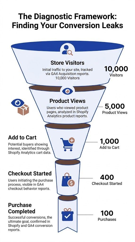
Start with the real funnel, not the homepage
In Shopify and GA4, build a funnel that reflects purchase intent rather than just pageviews. For most stores, that means tracking movement through landing page, collection or product view, add to cart, checkout start, and purchase.
That sounds basic, but many merchants still make decisions from blended store-wide averages. Those averages hide the leak. A product page might be doing its job while the cart is weak, or the cart might be healthy while checkout breaks on certain devices.
Use this review order each week:
- Traffic quality first: Check which channels bring visitors who reach product pages.
- Product intent next: Look at where people view products but don’t add to cart.
- Cart friction after that: Review where users show buying intent but stop before checkout.
- Checkout completion last: Inspect the final stretch for technical or trust issues.
If you need a deeper working framework for checkout-stage analysis, this guide on how to reduce cart abandonment fits neatly into this stage of the process.
Segment before you redesign
A common pitfall for initial CRO efforts is when merchants spot a drop-off and assume the page is bad for everyone. Often it isn’t. The issue may be localised to mobile Safari, a particular browser, or one traffic source sending low-intent clicks.
Research on funnel analysis stresses that mature CRO programmes instrument funnels by device and browser segment, because blockers are often localised. It also notes that checkout abandonment at the address step reached 38% in some case studies, with causes such as confusing field labels, broken autofill, or strict validation that only become obvious when segmented and reviewed closely, as outlined in Inspectlet’s conversion optimisation guide.
Here’s the practical takeaway. Before changing copy or layout, compare:
Aggregate data tells you where the pain is. Segmentation tells you who is feeling it.
Pair numbers with observation
Analytics tell you what happened. They rarely tell you why.
When a product page has strong traffic but weak add-to-cart behaviour, watch session replays. Look for hesitation patterns. Users scroll up and down, zoom images repeatedly, click delivery links, open returns information, or bounce to another tab. Those actions usually signal an unanswered question, not low intent.
The same applies in checkout. If users keep interacting with one field, retyping information, or backing out after shipping is shown, that’s not random behaviour. It’s friction you can often fix with clearer wording, stronger reassurance, or fewer surprises.
A useful weekly review rhythm is simple:
- Monday: Pull funnel numbers in GA4 and Shopify.
- Midweek: Review session recordings from the biggest drop-off pages.
- End of week: Match qualitative behaviour with technical issues, support tickets, and merchandising changes.
Correlate drop-offs with technical faults
Not every leak is messaging. Some are mechanical.
Look for JavaScript errors, failed network calls, slow-loading media, broken variant selectors, payment widgets that don’t render cleanly, or discount fields that behave unpredictably. On Shopify stores with multiple apps, these conflicts are common. They can cause unseen damage to a conversion path while the homepage still looks polished.
A product page can look “fine” in a team meeting and still fail in the browser conditions real shoppers use. That’s why diagnostics need both analytics and direct behaviour review. Without both, you’ll keep fixing the wrong thing.
Prioritising Your CRO Efforts for Maximum Impact
Once you start diagnosing properly, the problem flips. You no longer have too few ideas. You have too many.
That’s where many CRO efforts stall. The to-do list becomes a pile of “improve product page”, “test free shipping banner”, “fix mobile menu”, “add reviews”, “simplify checkout”, “change hero image”, and none of it is ranked. Teams then drift towards whatever is easiest, loudest, or most opinion-driven.

Use a simple scoring model
You don’t need an elaborate system. For most Shopify stores, a PIE model works well:
- Potential: How much could this fix improve performance?
- Importance: How much traffic or revenue does this page influence?
- Ease: How quickly can your team implement it?
Score each idea with short notes, not gut feel alone. A checkout issue affecting high-intent users should usually outrank a homepage aesthetic update. A product page trust problem on your top sellers should outrank a footer refresh every time.
Here’s the kind of contrast that matters:
For stores trying to improve basket size alongside conversion, it helps to understand how average order value strategy affects CRO decisions, because not every “conversion win” is equally valuable.
Don’t confuse visibility with impact
Merchants often over-prioritise whatever they see most. That usually means the homepage. Buyers, however, often make decisions on product pages, carts, and checkout steps.
A visible page isn’t automatically the most commercially important page. The pages closest to purchase usually deserve the earliest attention because the user intent is already there. You’re not creating desire from scratch. You’re removing resistance.
The best first test is rarely the most creative idea. It’s usually the fix that removes the clearest friction from the highest-intent path.
Keep your roadmap short
I prefer a short ranked list over a giant CRO backlog. Pick a few meaningful experiments or fixes for the next cycle and ignore the rest until the data changes.
A disciplined roadmap usually includes a mix of:
- One foundational fix such as speed, navigation, or trust information
- One purchase-path fix such as cart clarity or checkout friction
- One merchandising opportunity such as upsells, bundles, or product recommendation logic
That balance keeps your team focused. It also stops CRO from becoming a collection of disconnected ideas.
High-Impact On-Site and UX Improvements
Some store issues need testing. Others are bad buying experiences and should be fixed immediately.
If a shopper can’t understand the offer, trust the store, compare options, or buy comfortably on mobile, you don’t need an experiment to justify action. You need to remove friction.
Fix the product page before chasing clever ideas
Most Shopify stores win or lose on product pages. That’s where traffic turns into intent.
Your product page needs to answer four questions quickly:
- What is this?
- Why is it worth buying?
- Why should I trust this store?
- What happens if it isn’t right for me?
If those answers are vague, hidden, or split across multiple tabs, buyers stall. Strong product pages usually have cleaner hierarchy, better image sequencing, clearer variant selection, visible delivery and returns details, and copy that explains outcomes, not just features.
A few no-regret checks:
- Value proposition clarity: The first screen should explain what makes the product worth the price.
- Image usefulness: Show scale, texture, angles, and use context where relevant.
- Variant confidence: Make colours, sizes, or configurations easy to compare.
- Risk reduction: Put shipping, returns, and guarantee information where buyers can see it without hunting.
Reviews and UGC are not optional trust layers
This is one of the clearest conversion levers available. According to Landbase’s conversion statistics roundup, products displaying just five customer reviews are 270% more likely to be purchased compared to products with no reviews, and for high-ticket items, reviews drive a 380% increase in conversion.
That matters because trust hesitation gets stronger as purchase risk rises. If you sell considered products, expensive items, or anything buyers need to justify, social proof has to sit close to the buying decision.
Use more than star ratings. Good trust stacks often include:
- Written reviews: Buyers want specifics, not generic praise.
- Customer photos: These reduce uncertainty about fit, quality, and real-world appearance.
- Video testimonials: Useful where demonstration or reassurance matters.
- Review distribution: A mix of feedback feels more credible than a suspiciously perfect wall of praise.
If the same question appears in reviews again and again, answer it directly on the product page. Don’t make future buyers dig for it.
A useful visual walkthrough can help your team align on what a cleaner product experience looks like:
Site-wide friction often hides in plain sight
Founders often focus on the big conversion moments and ignore smaller UX faults that erode intent across the whole store.
Look closely at these areas:
Collection pages deserve special attention. If people can’t narrow products easily, they never reach the product page with confidence. Strong filtering and sorting do more CRO work than many merchants realise.
Checkout needs confidence, not just simplicity
Simplicity matters, but so does reassurance. Buyers want to feel they are still in control as they move toward payment.
That means clear field labels, obvious progress, visible payment methods, and calm handling of errors. Avoid vague validation messages. Avoid hiding key delivery information until late. Avoid forcing people to correct issues without explaining what went wrong.
Security badges can help, but only if the broader experience already feels trustworthy. Badges don’t rescue a confusing form.
Automating Pre-Sales to Reduce Abandonment and Lift AOV
A lot of conversion leaks happen before checkout even begins. The visitor is interested, but one question remains unanswered. Does it fit? Is shipping fast enough? Will it work for my use case? Which option suits my budget? If the answer doesn’t appear immediately, many shoppers leave.
That’s why pre-sales support should be treated as part of CRO, not just customer service.
Analytics shows the drop, conversations reveal the reason
A funnel report can tell you that buyers leave on product pages or abandon carts after browsing shipping information. It can’t always tell you what they were trying to resolve in that moment.
Pre-sales chats do. They expose objections in the customer’s own language.
You start seeing patterns like:
- “Do you ship to my country?”
- “What’s the difference between these two products?”
- “Which one is better for a small space?”
- “Can I return it if it doesn’t fit?”
- “Is this suitable for beginners?”
- “Do you have something similar but cheaper?”
Those aren’t support distractions. They are conversion clues. When you review them regularly, they become one of the most useful qualitative inputs in your CRO process.
Use AI chat as a sales input, not a widget
A weak live chat setup just creates another inbox. A stronger setup works more like guided selling.
That means the system shouldn’t only answer policy questions. It should also help shoppers narrow options, compare products, surface relevant information, and move toward checkout with more confidence. In Shopify, that can be done through tools that sync product catalogues and store policies so answers stay tied to the actual inventory and rules on site.
One option in that category is AI sales agents for Shopify, which handle pre-sales conversations, recommend products, and capture the objections buyers raise before they convert.
The useful shift is this. Treat pre-sales chat logs as research material, not just resolved tickets.
Multilingual support changes the conversion ceiling
For UK merchants, language can be a hidden blocker, especially if you attract international or multilingual audiences. In the UK market, where millions have a main language other than English, multilingual AI chatbots can boost conversions by 15-20% by automating support in 80+ languages, according to the referenced claim at CRSToday. The same source states that for high-ticket DTC brands, this kind of value-led engagement can increase AOV by 12-18% through personalised recommendations.
Whether or not your store is actively targeting non-English segments, the lesson is broader. Buyers convert more readily when they can ask nuanced questions in the language and style that feels natural to them. That removes hesitation at the exact point where many stores currently lose intent.
Build a feedback loop from chat to page optimisation
This is the part most merchants miss. They add chat, answer questions, and stop there. Significant value comes when you feed those patterns back into the site.
If buyers repeatedly ask about care instructions, add them to the page. If they struggle to compare two models, add a comparison block. If they keep asking whether returns are easy, move that reassurance higher. If budget questions come up often, improve recommendation logic and merchandising around price anchors.
A strong workflow looks like this:
Qualitative data becomes operational. You stop treating chat as a side channel and start using it to improve the pages that drive revenue.
AOV lifts often come from guidance, not pressure
Many stores try to increase basket size with blunt upsells. That can work, but it often feels generic. Consultative pre-sales support tends to perform better because it helps the buyer choose a more suitable option rather than pushing a more expensive one.
That difference matters. Recommending an accessory because it solves a stated need feels useful. Recommending a premium version because “you may also like” feels weaker unless the buyer already sees the reason.
When AI-assisted pre-sales is working well, it doesn’t just deflect support demand. It captures buying signals at the moment of decision and turns them into clearer pathways to purchase.
Designing and Measuring Your Experiments
Once the obvious friction is fixed and your priority list is clear, start testing. At this stage, many merchants become impatient. They launch a variation, check results too early, and call a winner before the data is ready.
That isn’t experimentation. It’s opinion with extra steps.
Build one hypothesis at a time
Every test should start with a simple sentence:
If we change X for Y audience on Z page, then this metric should improve because of a specific user behaviour insight.
That last part matters. The strongest hypotheses come from evidence, not creativity. If session replays show buyers hesitating around shipping details, test a clearer delivery message. If users stall in checkout, test a more supportive structure there. Don’t test random ideas just because they sound modern.
A practical experiment brief includes:
- Page or flow being tested
- Single element changing
- Reason for the test
- Primary metric
- Secondary watch metrics
- Expected customer behaviour change
- Decision rule for rollout
For a broader operating reference, it helps to align your process with documented conversion optimisation best practices.
Isolate the variable or you won’t learn much
If you change headline, imagery, product layout, and CTA copy at the same time, you may get a result, but you won’t know why it happened.
That’s why variable isolation matters. The methodological rule from Group 107’s CRO best practices is clear. A/B testing should aim for at least 95% confidence, and you should change only one element per test if you want valid attribution. The same source also notes a counterintuitive finding. Multi-step checkout forms often achieve 14% higher conversion rates than single-step forms, because progress indicators can create psychological momentum.
That’s a good reminder that “less friction” doesn’t always mean “fewer screens.” Sometimes structure reduces overwhelm better than compression.
Don’t ask, “Which design do we prefer?” Ask, “Which customer behaviour are we trying to change?”
Use a simple experiment template
Here’s a lightweight template worth keeping in a shared document.
Let the test finish
One of the most expensive habits in CRO is peeking too early. A variant looks ahead after a few days, someone gets excited, and the team rolls it out. Then performance fades because the result was noise.
Testing tools can calculate confidence levels for you, but discipline is still required. Let the experiment run to completion. Don’t stop because the chart looks promising. Don’t call a loss too early either. Some tests take time because buyer behaviour varies by weekday, campaign mix, or product demand.
A mature testing habit produces more than wins. It builds memory. Over time, you learn what your audience responds to, which assumptions keep failing, and where future gains are most likely to come from.
Building a Culture of Continuous Optimisation
The stores that improve steadily don’t treat CRO as a redesign project. They treat it as operating rhythm.
That means diagnosing the funnel regularly, ranking issues with discipline, fixing friction quickly, testing meaningful changes, and capturing what the team learns each time. Some tests win. Some don’t. Both are useful if you document the lesson and apply it.
The biggest mindset shift is simple. A conversion rate increase is not a one-time outcome. It’s the by-product of paying attention to how people buy from you, then removing what gets in their way. When that becomes normal inside the business, growth stops depending on guesswork.
Frequently Asked CRO Questions
How long does a conversion rate increase usually take?
Some UX fixes can help quickly, especially if they remove obvious friction. Proper testing takes longer because you need enough data to judge the result with confidence.
What should I optimise first on a Shopify store?
Start where intent is strongest and friction is clearest. In many stores, that means product pages, cart behaviour, and checkout steps before homepage redesign work.
Should I focus on conversion rate or average order value?
Both matter. A higher conversion rate with weaker basket quality can be less valuable than a smaller lift that also improves order size. Review them together, not in isolation.
Is A/B testing always necessary?
No. Some changes are basic usability fixes and should be implemented without debate. Testing matters most when you’re choosing between competing approaches or need evidence before rolling out a change broadly.
Why do analytics and customer conversations sometimes tell different stories?
They’re answering different questions. Analytics shows behaviour at scale. Conversations reveal the objections, confusion, and purchase anxieties behind that behaviour. Used together, they’re far more useful than either on its own.
If your store gets traffic but too many buyers leave with unanswered questions, Marvyn AI gives you a practical way to turn pre-sales conversations into revenue signals. It plugs into Shopify, syncs your catalogue and policies, answers shopper questions around the clock, and gives you conversation data you can feed back into your CRO work so you can improve both conversion rate and average order value.