Boost Sales with Customer Service Icons

A customer lands on your product page, pauses at the shipping line, glances at the tiny speech bubble in the corner, and leaves. They didn’t leave because your product was bad. They left because the page asked them to work too hard.
That’s where customer service icons stop being decorative and start doing real commercial work. On Shopify stores, icons often sit at the exact points where buyers hesitate: delivery, returns, sizing help, live chat, order tracking, and contact. If those visual cues are vague, inconsistent, or hard to tap on mobile, they create friction. If they’re clear, accessible, and placed with intent, they reduce hesitation and move shoppers forward.
I’ve seen merchants spend weeks refining product copy while leaving a confusing support icon set untouched. That’s backwards. Your chat launcher, returns icon, help triggers, and trust cues influence whether people ask a question, find an answer, and keep shopping. They also affect how well your automation performs, because customers can only use self-service tools if the entry points make sense.
Beyond Decoration How Icons Become Conversion Tools
Most stores treat icons like finishing touches. They pick a nice set, make it match the theme, and move on. That approach misses the point. Customer service icons are functional UI controls. They shape how quickly a shopper recognises where to get help and whether they trust that support will be useful.
When a buyer is unsure about delivery timing, return terms, or product fit, they look for immediate reassurance. They don’t want to hunt through your footer or decode a clever symbol your designer liked. They want obvious cues: chat, help, returns, shipping, contact. If those cues are clear, the customer keeps moving. If not, they bounce.
The commercial impact is larger than many merchants expect. In UK customer service, FCR above 70% is a key benchmark, and top-quartile performers hit 74% FCR, resulting in 25% lower ticket volumes, according to Zendesk’s customer service KPI benchmark. The same source notes that for DTC brands, AI-automated FCR has been shown to boost AOV by 15-20% by resolving questions during browsing. Icons play into that because they are often the gateway into automated support.
Practical rule: If a shopper can’t tell what your support icon does in a second or two, it isn’t helping conversion.
This is the same reason broader website optimization for conversion work matters. Conversion friction is rarely one big flaw. It’s usually a stack of small obstacles, and unclear support signals are one of them.
A strong icon system does three jobs at once:
- Reduces anxiety: It shows where help lives before a shopper feels stuck.
- Supports automation: It channels people into self-service and chat flows instead of forcing email-first support.
- Protects momentum: It keeps pre-purchase questions inside the buying session.
That’s why icon work belongs in the same conversation as product photography, landing page structure, and conversion rate increase strategies for ecommerce. The best stores don’t use support icons as decoration. They use them as silent sales infrastructure.
Selecting the Right Customer Service Icons
Choosing customer service icons starts with one question: should the icon be understood instantly by a first-time visitor? If the answer is no, reject it. Brand personality matters, but not more than recognition.
Match the icon style to the store
A mismatch is easy to spot. A minimalist skincare brand with chunky cartoon support icons looks unpolished. A rugged outdoor brand using ultra-thin abstract line icons often looks weak on mobile. Keep the visual language consistent with your theme, packaging, and product imagery.
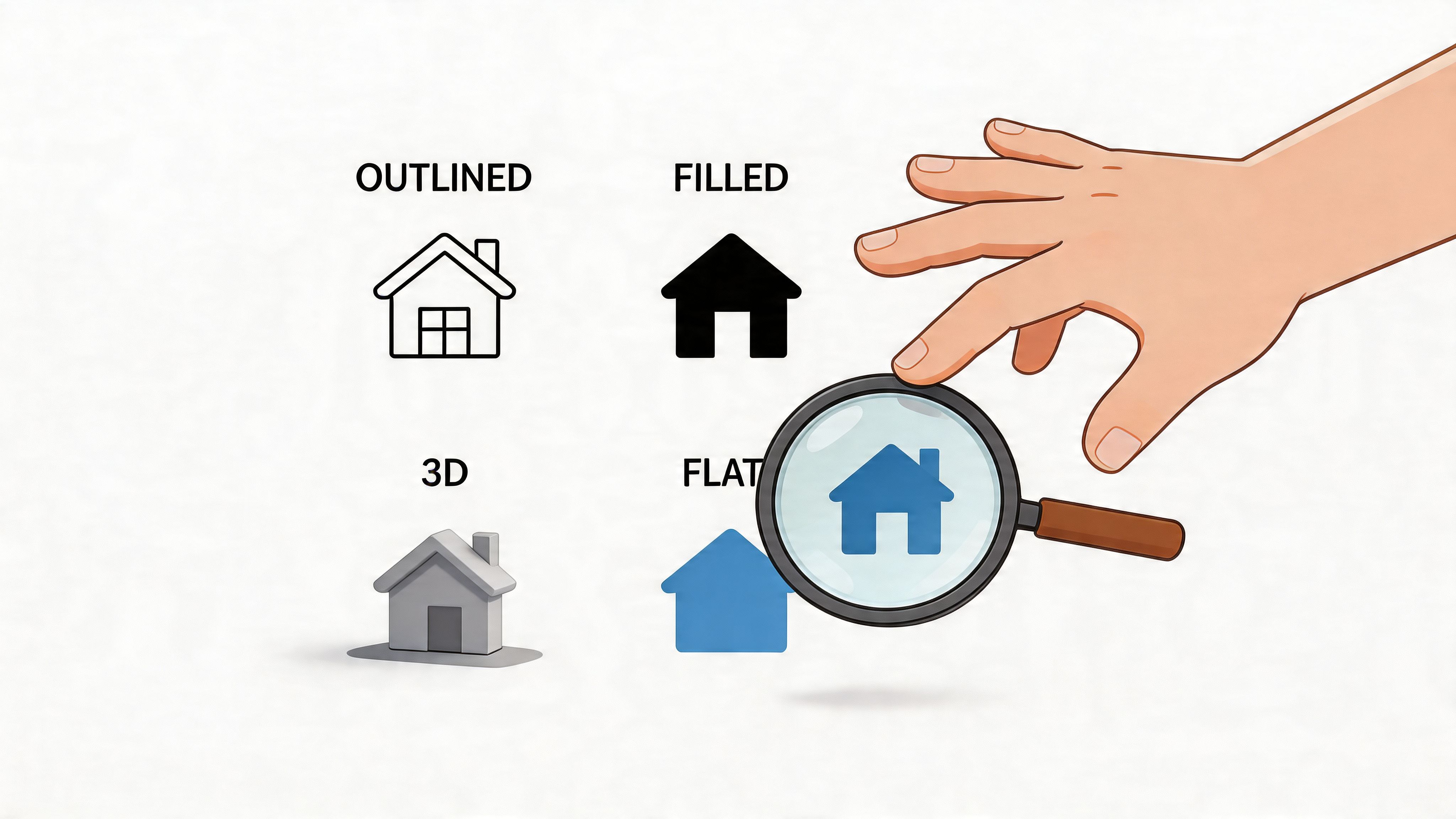
The three styles I see most often are:
- Line icons: Best for clean, modern themes where space is tight.
- Filled icons: Better when you need strong visibility at smaller sizes.
- Duo-tone icons: Useful when your brand system is mature and you can control contrast well.
Don’t mix all three unless you have a proper design system. Most Shopify stores don’t need that complexity.
Prefer familiar symbols over clever ones
For support functions, familiarity wins. A chat bubble, envelope, phone handset, question mark, location pin, package, and return arrow are widely understood. Once you swap those for a custom symbol, users have to learn your interface before they can use it.
That’s a poor trade unless the icon always appears with a text label.
The safest approach is simple: use standard symbols for core support actions, then customise colour, stroke weight, and spacing to make them feel on-brand.
This matters even more if your team is improving support workflows alongside design. A polished set of familiar icons tends to support cleaner journeys than an over-branded set that needs explanation. If you’re refining those workflows, these customer service best practices for ecommerce teams are a useful companion.
Pick the right file format
Many merchants download a pack without thinking about performance, scaling, or implementation. File format affects all three.
A quick decision filter
Before you add any icon to a live store, test it against four criteria:
- Recognition: Can a new visitor identify it without context?
- Legibility: Does it still work on a phone screen?
- Consistency: Does it match the rest of the interface?
- Implementation fit: Is the format practical for your theme and team?
If an icon fails even one of those, keep looking. Good customer service icons don’t need explaining. They should feel obvious.
Designing for Accessibility and Universal Clarity
A support icon that only works for fully sighted users on a high-quality screen isn’t good enough. Accessibility is not a design extra. It’s part of whether the interface works at all.
That matters legally and commercially. A 2025 UK eCommerce Accessibility Report by AbilityNet found that 72% of DTC sites fail basic icon accessibility tests, and only 18% of small Shopify stores use compliant visuals, which creates risk under the Equality Act 2010, as noted in this customer service icon accessibility reference. If your chat, returns, or help icons are low contrast, too small, or unlabeled, you’re excluding shoppers who want to buy from you.
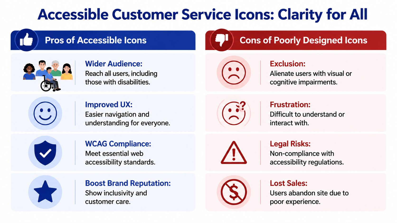
Contrast, size, and shape matter more than style
Merchants often focus on whether an icon looks modern. The better question is whether it remains clear against every background and at every breakpoint. Thin grey icons on a white footer may look refined on a designer’s monitor, but they regularly fail in real use.
Use these rules:
- Check contrast: Test icon colour against the actual background colour, not just your brand palette.
- Avoid colour-only meaning: Don’t make users rely on green versus red to understand a support action.
- Preserve shape recognition: A truck should still read as delivery support when scaled down.
- Use SVG where possible: Vector icons stay crisp when resized across mobile and desktop.
If you need a solid general reference point, these website accessibility best practices are useful because they frame accessibility as usability, not just compliance.
Label important icons properly
Icons alone work well when the symbol is universally understood and the context is obvious. For anything more important than that, pair the icon with text or add proper accessibility labels in code.
Here are two common patterns:
```html
```
```html
```
The important details are straightforward:
- Use `aria-label` when the icon acts as a clickable control without visible text.
- Set decorative SVGs to `aria-hidden="true"` so screen readers don’t announce meaningless shapes.
- Add visible labels for high-stakes actions such as returns, delivery help, and support contact.
Don’t bury accessibility inside the theme build
Accessible customer service icons need checking in an actual storefront, not just in Figma or a dev preview. Test them in the header, footer, sticky bars, and mobile drawers. Then test them again with zoom, keyboard navigation, and a screen reader.
Poor icon accessibility usually comes from small implementation shortcuts, not big strategic mistakes.
That’s why I recommend treating support UI as part of the wider customer journey. If the icon system is hard to perceive or interact with, the help experience breaks before the support team or chatbot gets a chance to perform. For merchants tightening the full journey, this guide on how to improve ecommerce customer experience is worth reviewing alongside your icon audit.
Strategic Icon Placement on Your Shopify Store
Placement decides whether customer service icons get used or ignored. I’ve seen perfectly good icon sets underperform because they were hidden in the wrong part of the layout, crowded by promos, or shown too late in the journey.
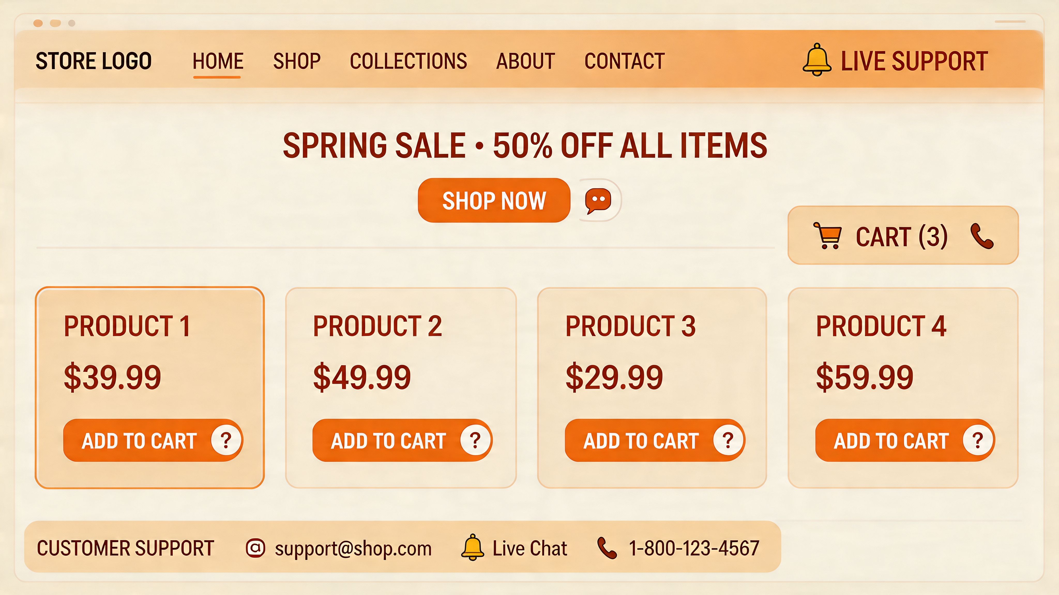
Header and footer placement
Your site-wide support icons need persistent visibility. The header is best for immediate access. The footer is best for reassurance and fallback navigation. Don’t make one area carry both jobs.
In the header, keep the support signal light but clear. A chat icon, help centre trigger, or contact shortcut can work well there if it doesn’t compete with cart and account actions. In the footer, use icons to group practical links such as contact, shipping, returns, and tracking.
What doesn’t work is overloading the header with every possible support option. Too many icons turn the top bar into noise.
Product page placement
The product page is where support icons earn their keep. Buyers have real objections at this point, and visual reassurance can reduce that friction before it turns into a ticket or a lost sale.
The best product page placements usually include:
- Near the add-to-cart area: Icons for shipping, returns, and support answer the last-minute questions that block action.
- Inside collapsible information rows: This keeps the page clean while still making help discoverable.
- Below price or variant selectors: This is often where uncertainty peaks, especially for sizing, availability, or dispatch timing.
A lot of merchants bury these cues in tabs far below the fold. That’s usually too late.
Chat launcher placement and behaviour
The floating chat icon is the most important customer service icon on many Shopify stores. It should be visible without covering key controls, especially on mobile where screen space is scarce.
Good launcher behaviour usually means:
- Anchored in a predictable corner: Most stores use the lower right, unless another fixed element already lives there.
- Clear visual separation: The launcher should stand out from promotional badges and loyalty widgets.
- A sensible default state: Visible, but not so aggressive that it blocks product interaction.
A practical benchmark for placement reviews is to compare your store against strong Shopify store examples with clear customer journeys. You’ll quickly notice that high-performing stores rarely hide support entry points.
For merchants serving international buyers, placement also needs to account for language direction. UK Office for National Statistics data from Q1 2026 shows a 28% growth in non-English traffic to DTC sites, and 65% of UK merchants report cart abandonment from misaligned icons in right-to-left languages, leading to a 15-20% AOV loss, according to this multilingual customer service icon market reference. If you support Arabic or Hebrew experiences, mirroring icon direction and widget placement isn’t optional.
A quick walkthrough of storefront support placement can help teams spot issues faster:
Optimising Icons for Your Marvyn AI Chatbot
When merchants talk about chatbot performance, they usually focus on training data, prompts, and routing logic. Those matter. But the visual layer matters too. If the launcher icon looks generic, unclear, or out of place, fewer shoppers engage with it in the first place.
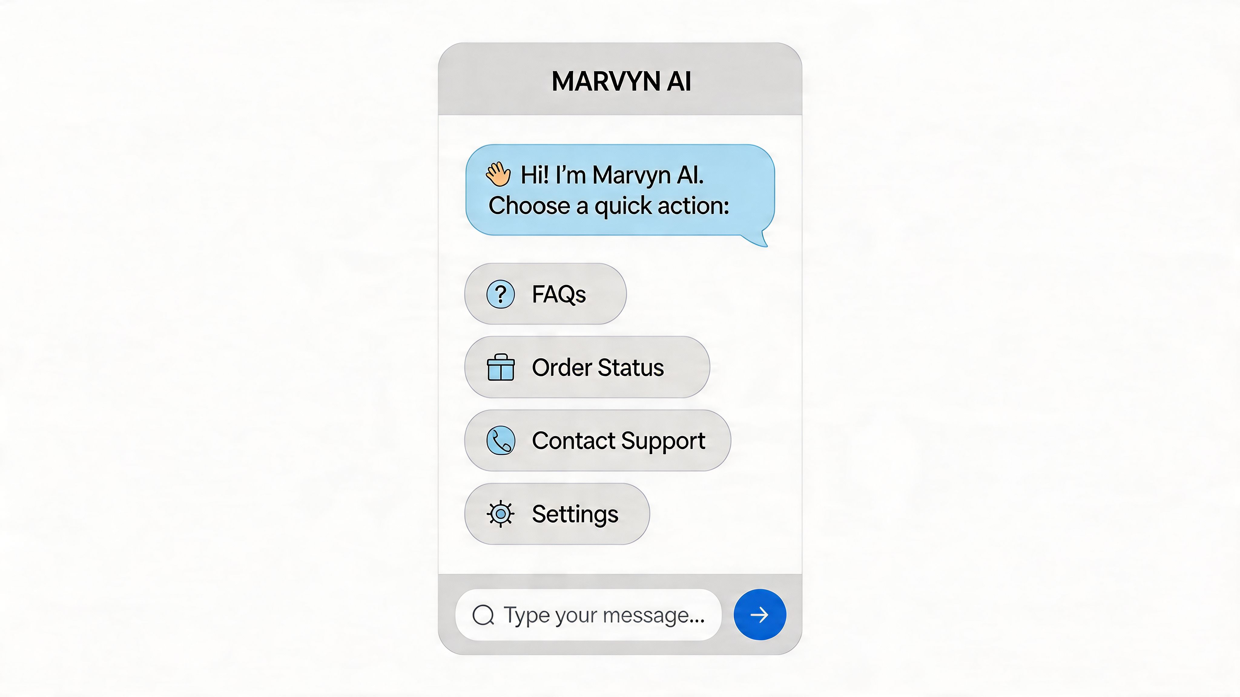
Start with the launcher
The launcher is your first support handshake. It should feel trustworthy, easy to recognise, and consistent with the rest of the storefront. That usually means matching brand colours, respecting the site’s corner radius and button style, and avoiding novelty icons that hide the chatbot’s purpose.
For most Shopify stores, the strongest launcher options are still simple:
- Chat bubble: Best when support and pre-sales are both key.
- Help icon plus label: Strong when buyers often need guidance before purchase.
- Branded chat button: Good for mature brands that can support stronger customisation without losing clarity.
If your launcher needs explanation, your adoption will suffer.
Use icons inside the chat flow
Customer service icons directly improve automation efficiency. A chatbot menu filled with text links feels heavier than one with recognisable visual actions. When shoppers open chat, they should see obvious paths like order tracking, shipping, returns, product help, and contact.
Good in-chat icon use looks like this:
- Truck icon for Track order
- Box or circular arrow for Returns
- Magnifying glass for Find products
- Question bubble for FAQs
- Gift or tag for Promotions or bundles
These icons reduce cognitive load. They also help users self-select the right journey faster, which improves the odds of successful automated resolution.
A chatbot doesn’t need more buttons. It needs clearer choices.
That’s also why implementation matters. If you’re evaluating broader AI chatbot integration work, pay attention to the launch surface and interaction design, not just the model or app connection.
Align visuals with support logic
The best chatbot icon systems reflect what the bot can do. Don’t show an icon for live phone help if the store doesn’t offer it. Don’t use a generic support symbol to launch a sales-focused assistant that mainly recommends products. Visual honesty matters.
A cleaner structure is to map icons to your highest-volume intents:
- Pre-purchase guidance for product questions and comparisons
- Order support for tracking and delivery status
- Policy support for returns, shipping, and exchanges
- Escalation paths when a human needs to step in
When these visual cues line up with actual capabilities, users trust the system more and abandon it less often. If you’re refining that flow, it helps to review practical chatbots for customer service examples and implementation ideas.
Testing and Measuring Icon Performance
If you can’t measure whether your customer service icons are helping, you’re guessing. The fix isn’t complicated. Track icon performance the same way you track any other conversion touchpoint.
What to measure first
Start with direct interaction metrics. These tell you whether people notice and use the icons at all.
Focus on:
- Click-through rate on the chat launcher
- Clicks on returns, shipping, and contact icons
- Use of help icons on product pages
- Drop-off after icon interaction
Then connect those to support outcomes. Are repetitive questions declining? Are more shoppers reaching self-service answers before contacting the team? Are product-page support interactions leading to checkout progress?
Tie icon changes to business KPIs
The most useful metric for support UI isn’t the raw click count. It’s whether those clicks lead to efficient resolution and stronger commercial outcomes. That’s why icon testing should sit beside automation reporting.
For UK Shopify merchants, targeting an Automated Resolution Rate of 65-70% can automate over 70% of tickets and slash operational costs by 40%, while a Zowie report found that an elite 68% ARR reduced support tickets by 72% and increased AOV by 22%, based on Zowie’s customer service metrics analysis. Icons influence this because they determine whether users enter the right automated path early enough.
Run small tests with clear variables
You don’t need a major redesign to learn something useful. Test one variable at a time.
Good tests include:
- Icon only versus icon plus text: This is especially useful for returns and support actions.
- Filled icon versus line icon: Often relevant on mobile where smaller tap targets matter.
- Launcher colour variants: Useful when the current chat trigger blends into the page.
- Position tests: Lower right versus a less crowded corner, if your layout permits.
Use heatmaps and session recordings alongside click data. They often reveal simple problems, such as users tapping a decorative icon that isn’t clickable or overlooking a support trigger because it sits too close to a promotional badge.
If users repeatedly hover, hesitate, or tap the wrong visual, the icon system is creating work instead of removing it.
The best-performing setups usually look obvious in hindsight. That’s the point. Good support UI rarely feels clever. It feels effortless.
Frequently Asked Questions About Icons
Should customer service icons be animated
Usually no. Animation can attract attention, but it also adds visual noise, can distract from product content, and may create accessibility issues for some users. For core support actions, clarity beats motion. If you use animation at all, keep it subtle and reserve it for one element, usually the chat launcher.
When should I pair icons with text labels
Pair icons with text when the action affects trust, money, or support expectations. Returns, shipping, order tracking, and contact links are better with labels in most Shopify builds. A plain icon is usually fine when the symbol is universally recognised and the context is obvious.
Are free icon libraries good enough
Sometimes. They’re fine if the licence is clear, the style is consistent, and the symbols are recognisable. They’re not fine if you’ve cobbled together icons from multiple packs with different stroke widths, corner treatments, and meanings. Consistency matters more than price.
Which file type should I use for most stores
For most Shopify support UI, SVG is the safest choice because it stays sharp across screen sizes and is easier to style cleanly. PNG still has a place for fixed visuals, but it’s rarely the best default for interactive customer service icons.
How many support icons should a product page include
Fewer than most merchants think. Start with the questions buyers ask most often before purchase. Shipping, returns, support access, and sometimes sizing or fit are the common essentials. If every reassurance point becomes an icon row, the page starts competing with itself.
If your Shopify store gets the same pre-sales questions every day, Marvyn AI can turn those conversations into automated, revenue-driving support. It installs in one click, syncs your catalogue and policies, and helps shoppers get answers fast without adding ticket volume to your team.