Icons That Talk: Boost Shopify Conversions With AI
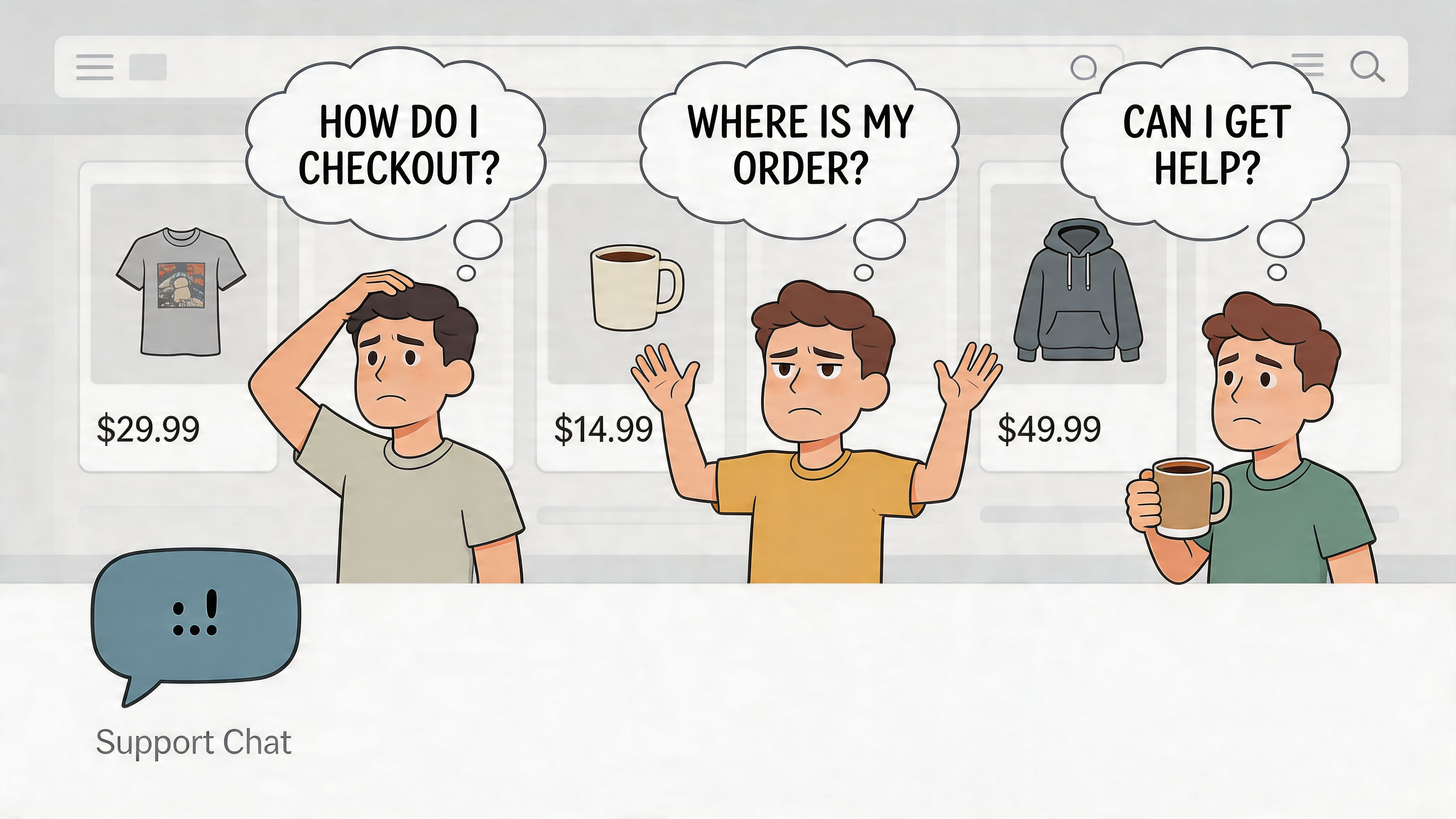
Your store already has a chat icon. It probably sits in the lower corner, waits to be clicked, and does almost nothing to earn attention.
That’s the problem.
Most chat icons are treated like plumbing. They exist because every store is expected to have one. But in practice, a silent icon often becomes invisible. Shoppers hesitate, wonder whether anyone is available, and leave with unanswered questions about sizing, shipping, returns, compatibility, or stock. A better approach is to build icons that talk. Not gimmicky mascots, and not noisy animations for the sake of it, but small interface elements that actively guide the customer, support screen readers, and trigger useful conversations at the right moment.
On Shopify, this matters more than many founders realise. The icon isn’t just decoration. It’s the front door to support, pre-sales assistance, and reassurance at checkout. If that front door looks generic, passive, or inaccessible, you create friction before the conversation even begins.
Why Your Silent Chat Icon is Costing You Sales
A static chat bubble asks the customer to do all the work. They have to notice it, interpret it, trust it, and decide that clicking it is worth the interruption.
Most shoppers won’t.
Passive icons get ignored
The typical Shopify setup uses a small bubble with no movement, no voice cue, no sign of relevance, and no context. It’s present, but it isn’t persuasive. That’s a poor use of prime screen space.
A talking icon changes that behaviour. It can pulse gently, announce itself to assistive technology, reveal a short prompt, or trigger a useful opener such as order tracking, delivery help, or product advice. The shift is subtle, but commercially important. Instead of waiting for intent, the icon helps create it.
For stores that want a baseline for cleaner visual language, Marvyn’s guide to customer service icons is a useful starting point.
A good chat icon doesn’t scream for attention. It reduces hesitation.
Talking doesn’t just mean audio
When people hear “icons that talk”, they often picture a novelty effect. That’s not the useful version.
In practice, a talking icon can mean:
- Visual prompting through motion that suggests availability
- Accessible narration through ARIA labels and screen reader support
- Contextual microcopy such as “Need sizing help?”
- Triggered interaction that opens the right conversation flow at the right moment
That distinction matters because the wrong implementation becomes clutter. There’s a strong design lesson here. Repeating icons without a clear purpose adds cognitive load, which is exactly why thoughtful use beats decoration-first design.
The business issue is hesitation
The stores that benefit most from icons that talk usually have one thing in common. Customers need reassurance before they buy.
That could be a skincare routine, a made-to-order sofa, a supplement with ingredient questions, or a fashion purchase where fit uncertainty kills confidence. In each case, the icon’s job is to shorten the distance between doubt and action.
If the icon only says “chat exists here”, it underperforms. If it says “I can help you choose, check delivery, or track your order”, it starts earning its place.
Designing a Talking Icon That Fits Your Brand
The design work starts before code. If you skip strategy and jump straight into animation, you usually end up with an icon that feels borrowed from another brand.
Choose a role before a shape
Your icon needs a job description. I use three broad roles when planning these builds:
A children’s brand might use a friendly speech bubble with soft motion. A premium furniture store will usually do better with a minimal waveform, subtle glow, and restrained entrance. A tech accessories brand can lean into crisp motion and utility-first design.
The wrong choice creates mismatch. A playful mascot on a luxury store weakens trust. A sterile symbol on a lifestyle brand feels outsourced.
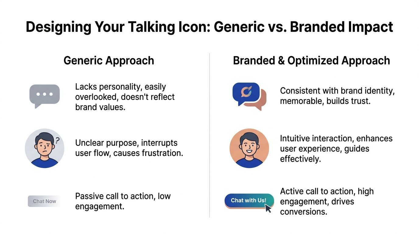
Generic assets rarely carry brand trust
This is one place where shortcuts are expensive. While repositories like Flaticon offer over 59,000 generic “success” icons, a custom-designed, animated icon that aligns with your brand’s unique identity is significantly more effective at capturing user attention and initiating engagement according to the available source material at IconScout’s success rate icons page.
That doesn’t mean you need an agency-grade illustration. It means the icon should inherit your brand system:
- Colour pulled from your existing palette
- Shape language that matches your buttons, cards, and menus
- Tone that reflects how your brand speaks
- Motion style that fits the pace of the site
If your emails, PDPs, and banners feel warm and human, your chat icon shouldn’t look like a default app embed. For stores refining first-impression language at the same time, these examples of welcoming messages on websites help align visual tone with copy.
Pick one animation pattern
Don’t stack effects. One strong motion pattern beats three average ones.
Here’s a practical comparison:
- Soft pulse
Good for most stores. It catches peripheral attention without feeling needy.
- Speaking bounce
Useful when paired with a short greeting bubble. Stronger cue, higher risk of distraction.
- Waveform motion
Best for modern, minimal brands. Suggests voice or intelligence without showing a literal character.
- Idle shimmer
Suitable for premium visuals, but weak if used alone. It often looks decorative rather than interactive.
Practical rule: If the animation still looks sensible with the sound off and the tooltip hidden, you’re on the right track.
Write the icon’s first line
The icon’s appearance matters, but the opening line often decides whether someone engages. Keep it specific.
Instead of:
- Chat now
- Need help?
- Ask us anything
Use prompts tied to real intent:
- Find your best size
- Check delivery before you order
- Compare two products
- Track an order
That line turns the icon from ornament into navigation.
Preparing Your Visual and Audio Assets
Most implementation problems start with messy assets. The code gets blamed, but the underlying issue is usually a poor file setup, oversized media, or inconsistent naming.
Start with the right file types
For the icon itself, SVG is usually the best choice. It stays sharp on any screen size, supports animation well, and is easier to style with CSS than a flat PNG.
Use PNG only when the artwork is too complex for a clean SVG export. For example, if you’re using a heavily textured illustration or a shaded mascot head, PNG may be simpler. Even then, keep a fallback static SVG for smaller breakpoints if possible.
For audio, use short clips and keep them optional. A tiny greeting sound or spoken cue can work, but long autoplay intros are a mistake. They feel intrusive and often create accessibility problems rather than solving them.
Build an asset checklist
Before touching Liquid, gather everything in one place:
- Primary icon file with a clear name such as `talking-icon.svg`
- Hover or active state asset if your design swaps frames
- Optional audio file kept short and compressed
- Fallback icon for reduced-motion or no-audio scenarios
- Copy deck with button text, tooltip text, and aria-label language
That last item matters more than is commonly understood. Stores often spend time polishing the visual and then write rushed copy like “Hi there”. That wastes the interaction.
A good source of inspiration for short, natural phrases is everyday support language. Even though it’s written for a different channel, this list of greetings for emails is useful because it forces clarity and tone discipline.
Keep Shopify delivery simple
Upload final assets to Shopify’s file area or package them directly in theme assets, depending on how tightly you want them coupled to the theme. The important part is consistency.
Use filenames that survive handover:
- `chat-icon-brand.svg`
- `chat-icon-speaking.svg`
- `chat-greeting-soft.mp3`
Avoid vague names like `final2-new.svg`. Six months later, nobody knows what’s safe to replace.
Prepare for graceful failure
Every talking icon needs a quiet mode.
Some visitors browse with reduced motion enabled. Some block autoplay. Some use screen readers. Some don’t want animated distractions. Your asset preparation should account for that before implementation starts.
If the icon only works when motion, sound, and JavaScript all fire together, it isn’t robust enough for a production store.
Building Your Interactive Icon with Code Snippets
A clean Shopify implementation keeps the icon reusable. Don’t hardcode it into one template if you plan to test placement or behaviour later. Put it into a snippet and control settings from one place.

For merchants who haven’t worked with theme structure before, this overview of Shopify app creation helps explain how snippets, scripts, and integrations fit together.
Create the Liquid snippet
Add a new snippet such as `talking-icon.liquid` and start with semantic structure.
```liquid
<button
class="talking-icon-button"
type="button"
aria-label="Open chat for product help, delivery questions, or order support"
aria-expanded="false"
aria-controls="talking-icon-panel">
{% render 'icon-chat-custom' %}
<div
id="talking-icon-panel"
class="talking-icon-panel"
hidden>
```
This does three jobs. The `button` gives you keyboard accessibility by default. The visual span separates the icon art from the accessible name. The hidden panel gives you a hook for opening a widget, loading content, or handing control to your chat tool.
Add CSS that signals life without creating noise
The animation should be visible, but not restless.
```css
.talking-icon-wrap {
position: fixed;
right: 20px;
bottom: 20px;
z-index: 999;
}
.talking-icon-button {
display: flex;
align-items: center;
gap: 10px;
background: #1E40AF;
color: #fff;
border: 0;
border-radius: 999px;
padding: 12px 16px;
cursor: pointer;
box-shadow: 0 8px 24px rgba(0,0,0,0.12);
}
.talking-icon-visual svg {
width: 24px;
height: 24px;
display: block;
}
.talking-icon-tooltip {
font-size: 14px;
line-height: 1;
white-space: nowrap;
}
.talking-icon-button.is-idle {
animation: softPulse 2.6s infinite;
}
.talking-icon-button.is-speaking .talking-icon-visual {
animation: speakBob 0.8s ease-in-out 3;
}
@keyframes softPulse {
0%, 100% { transform: scale(1); }
50% { transform: scale(1.04); }
}
@keyframes speakBob {
0%, 100% { transform: translateY(0); }
50% { transform: translateY(-2px); }
}
@media (prefers-reduced-motion: reduce) {
.talking-icon-button,
.talking-icon-visual {
animation: none !important;
transition: none !important;
}
}
```
A few practical notes matter here. Fixed positioning is standard, but test around cookie banners and sticky add-to-cart bars. The reduced-motion query isn’t optional if you’re serious about accessibility. The tooltip is visible in this example, but many brands choose to hide it on mobile until first interaction.
Use JavaScript for timing and behaviour
This layer controls when the icon changes state and what happens when someone engages.
```javascript
document.addEventListener('DOMContentLoaded', () => {
const button = document.querySelector('.talking-icon-button');
const panel = document.getElementById('talking-icon-panel');
const audio = document.getElementById('talking-icon-audio');
if (!button) return;
button.classList.add('is-idle');
const triggerGreeting = () => {
button.classList.remove('is-idle');
button.classList.add('is-speaking');
if (audio) {
audio.play().catch(() => {
/ autoplay may be blocked /
});
}
setTimeout(() => {
button.classList.remove('is-speaking');
button.classList.add('is-idle');
}, 2500);
};
setTimeout(triggerGreeting, 4000);
button.addEventListener('mouseenter', () => {
button.classList.remove('is-idle');
});
button.addEventListener('mouseleave', () => {
button.classList.add('is-idle');
});
button.addEventListener('click', () => {
const expanded = button.getAttribute('aria-expanded') === 'true';
button.setAttribute('aria-expanded', String(!expanded));
if (expanded) {
panel.hidden = true;
} else {
panel.hidden = false;
if (window.dispatchEvent) {
window.dispatchEvent(new CustomEvent('talking-icon-open'));
}
}
});
});
```
The key detail is restraint. The timed greeting should happen once, not on every page view event. Hover should alter state lightly. Click should do one obvious thing.
Render it in theme files
Place the snippet in `theme.liquid` or a global section so it loads site-wide.
```liquid
{% render 'talking-icon' %}
```
If you want more control, render it only on product, collection, cart, and help pages. That’s often better than showing it everywhere. An icon that appears on every template, regardless of shopper intent, can lose relevance fast.
Common implementation mistakes
- Attaching animation to the wrong element
Animate the wrapper or visual span, not the entire fixed container if it causes layout jitter.
- Using autoplay audio as the main feature
Browsers will block it inconsistently, and many users won’t welcome it.
- Ignoring mobile thumb reach
Bottom-right is standard, but not always ideal if your store uses sticky UI elements.
- Forgetting fallback states
If JavaScript fails, the button should still display cleanly and remain clickable.
Build the icon so it still makes sense as a plain button. Then enhance it.
Supercharging Your Icon with Accessibility and AI
The jump from a neat animated icon to a commercially valuable one happens when accessibility and intelligence are built into the same interaction.
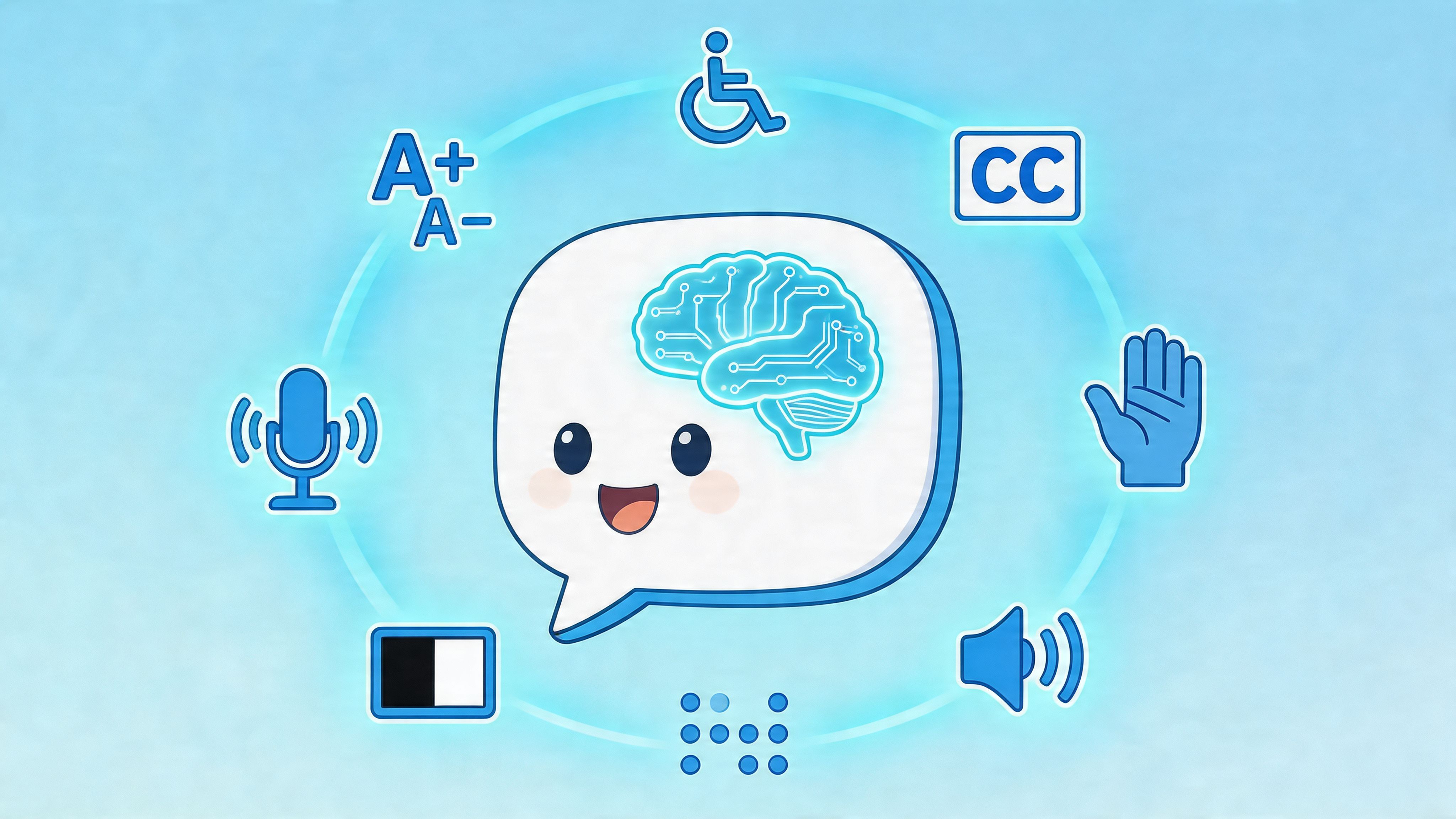
Accessibility changes the business case
Even if you treat those figures cautiously, the direction is clear. Accessibility isn’t a side task for legal pages and footer links. It directly affects whether shoppers can discover help, understand options, and complete checkout with confidence.
Add ARIA that does real work
A lot of storefronts add `aria-label` and stop there. That’s not enough when the icon changes state, opens messages, or triggers assistive announcements.
Use a structure like this:
```html
<button
class="talking-icon-button"
aria-label="Chat for help with products, delivery, and orders"
aria-haspopup="dialog"
aria-expanded="false"
aria-controls="chat-dialog">
<div
id="chat-status"
class="visually-hidden"
aria-live="polite">
```
Then update the live region in JavaScript when needed:
```javascript
const liveRegion = document.getElementById('chat-status');
function announceChatState(message) {
if (!liveRegion) return;
liveRegion.textContent = '';
setTimeout(() => {
liveRegion.textContent = message;
}, 100);
}
```
Use it sparingly. Good examples include:
- “Chat opened”
- “Product help available”
- “Order support ready”
Bad examples include repeated promotional messages or constant announcements tied to idle animation. Screen reader users shouldn’t have to fight your interface to shop.
For brands exploring broader sales automation, Marvyn’s article on AI for sales gives useful context on when conversational AI supports buying decisions best.
Connect the icon to an actual brain
Without intelligence behind it, a talking icon is still mostly a wrapper. It can invite action, but it can’t resolve much.
The practical pattern is straightforward:
- Customer clicks the icon.
- The icon opens the chat interface.
- The assistant starts with context-aware help.
- The handoff to a human remains available when needed.
That’s where AI earns its keep. It can answer repetitive questions, guide product discovery, interpret broad customer intent, and keep the experience consistent outside working hours. For high-consideration purchases, this matters because many shoppers don’t want to “contact support”. They want immediate buying guidance.
Accessible conversation design works best when the interface tells the user what’s happening, and the assistant answers the question they meant to ask.
Don’t confuse accessibility with novelty
Audio alone isn’t accessibility. Animation alone isn’t engagement. AI alone isn’t helpful if the entry point is vague.
The best icons that talk combine all three layers:
- a discoverable visual cue
- proper assistive support
- a useful conversation behind the click
That combination is where the feature stops being cosmetic.
Testing and Optimising for Performance and Conversions
Once the icon is live, the job shifts from building to proving. A talking icon that slows the site, clashes with mobile UI, or creates empty chats isn’t finished.
Check performance first
Test the store before and after launch using your usual performance workflow. The key questions are simple. Did the icon introduce unnecessary JavaScript, oversized SVG markup, or audio requests that trigger too early?
Audit these areas:
- Load behaviour
Make sure audio isn’t fetched before it’s needed, and defer non-critical scripts where possible.
- Animation smoothness
Keep motion on transform and opacity where possible. Those properties tend to behave better than layout-affecting changes.
- Mobile overlays
Confirm the icon doesn’t sit on top of sticky bars, accessibility controls, or region selectors.
If you see a layout jump or laggy entrance, simplify before you optimise. Most issues come from trying to make the icon do too much.
Test one variable at a time
Founders often change colour, text, timing, size, and placement together, then can’t tell what helped. Keep your tests narrow.
A sensible test queue looks like this:
- Position
Bottom right versus bottom left, especially if your mobile theme already has fixed controls.
- Prompt copy
“Need help choosing?” versus a product-specific message.
- Animation timing
Immediate motion versus delayed motion once the shopper has engaged with the page.
- Visual style
Compact icon-only button versus icon plus visible text.
Track behaviour that leads to revenue
Not every interaction is valuable. Focus on the chain between icon discovery and purchase intent.
Useful indicators include:
- chat starts from product pages
- product recommendation requests
- order support deflection
- assisted checkout journeys
- repeat use by returning visitors
Some stores also learn that the icon performs differently by collection. Apparel shoppers may want fit help. Furniture buyers may care about delivery and dimensions. Supplements buyers may ask ingredient or routine questions. Use those patterns to tailor the opener, not just the appearance.
Know what doesn’t work
Three patterns fail repeatedly:
- Constant movement
It creates banner blindness fast.
- Vague prompts
If the icon says almost nothing, shoppers assume it won’t help much either.
- Overdesigned interaction
A character that waves, speaks, glows, and expands all at once can feel like an advert, not assistance.
The strongest setups usually look more restrained after optimisation than they did on day one.
Frequently Asked Questions
Do icons that talk need actual audio?
No. Audio is optional. In many Shopify stores, the most effective version uses motion, clear microcopy, and strong screen reader support rather than spoken sound. If you do add audio, keep it short and make sure the experience still works without it.
Will this require a custom app?
Not always. Many stores can implement a talking icon with a Shopify snippet, CSS, and a small JavaScript layer. A custom app is more useful when you need advanced settings, deep theme portability, or a more complex integration.
Can a talking icon hurt conversion rate?
Yes, if it’s distracting, irrelevant, or badly timed. The feature should reduce friction, not create it. That’s why restrained motion, intent-based prompts, and proper testing matter.
Should the icon appear on every page?
Usually not. Product pages, cart, help pages, and selected collection pages often deserve the most attention. Home page placement can work, but broad visibility isn’t always the same as usefulness.
What’s the best first message?
Use a message tied to the shopper’s task. Product selection, delivery timing, returns, and order tracking are usually better than generic greetings. The icon should sound like it already knows why someone might need help.
Is accessibility really worth prioritising this early?
Yes. If the icon is your entry point to support and sales assistance, accessibility isn’t a later enhancement. It’s part of the feature itself. Retrofitting it later usually costs more and works worse.
If your Shopify store gets traffic but too many shoppers leave with unanswered questions, Marvyn AI is worth a look. It gives you a fully autonomous Shopify AI chatbot that can handle customer service, guide product discovery, and support consultative sales around the clock, while staying fast to deploy and easy to customise.